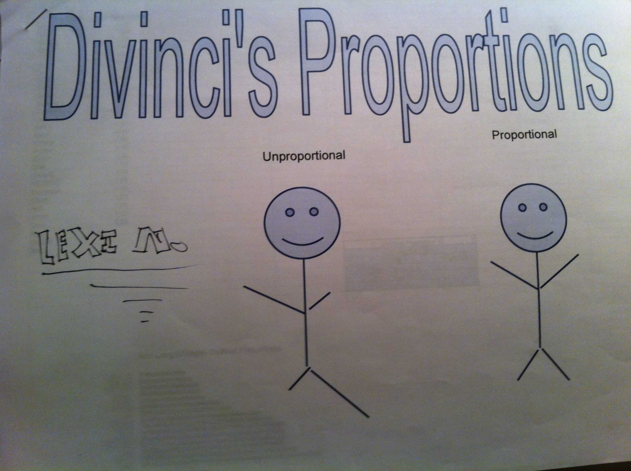
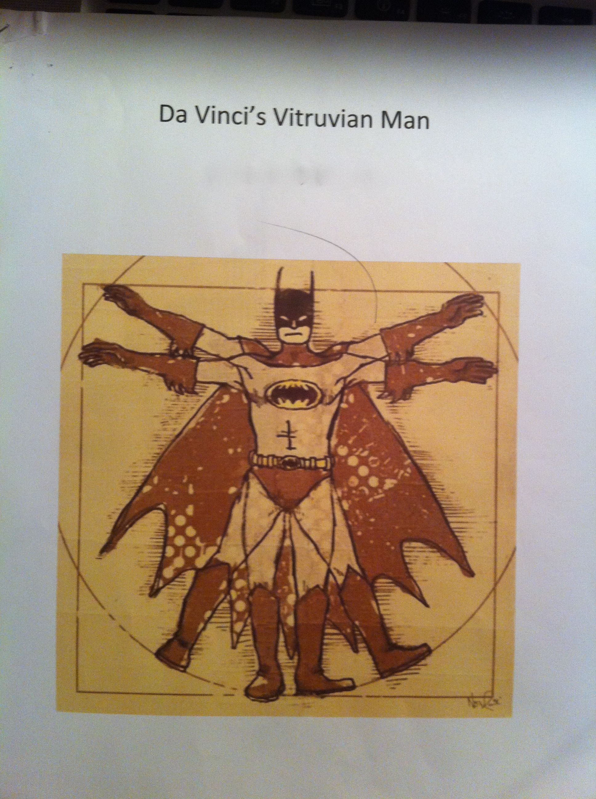
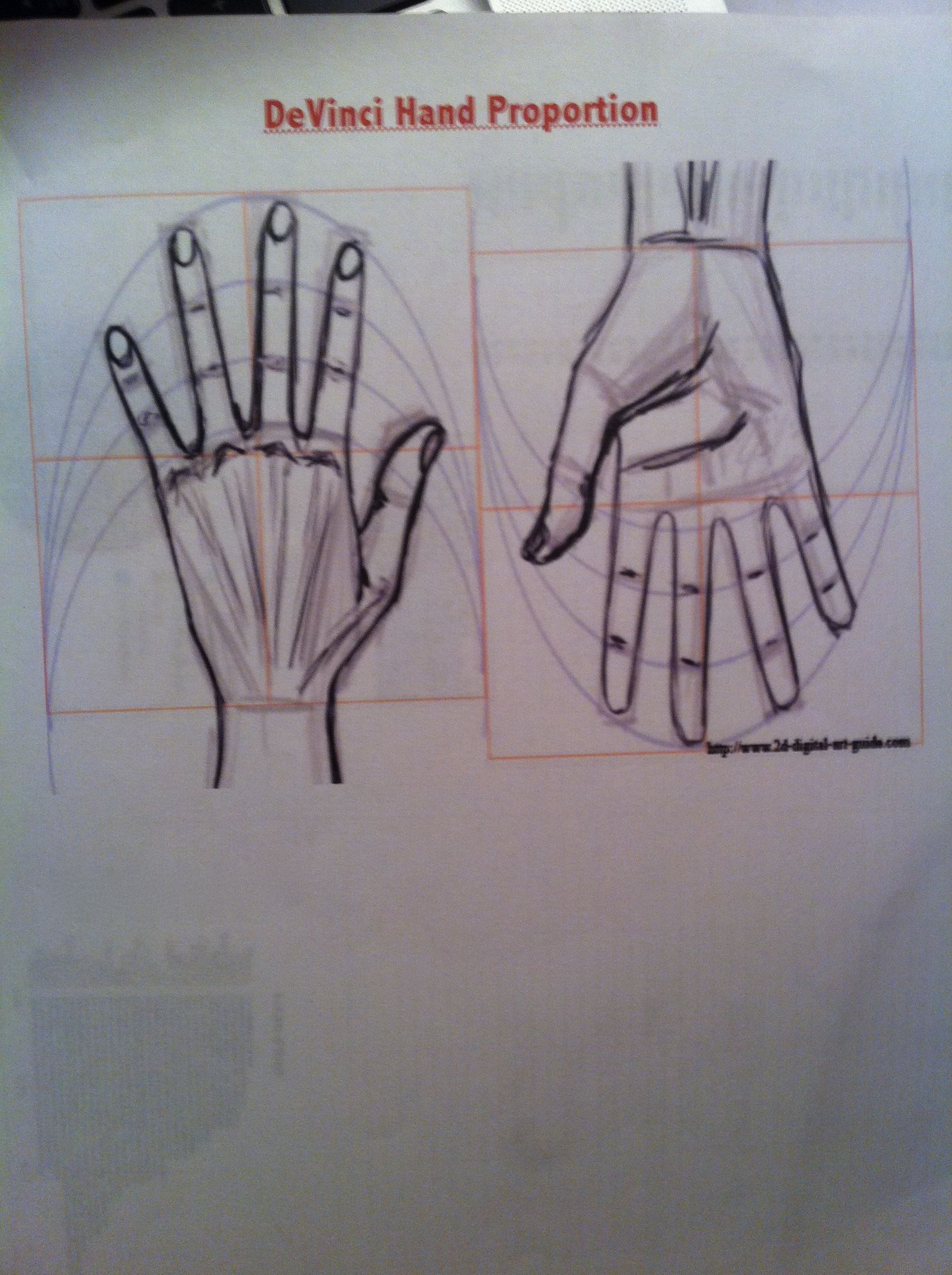
In our 6th grade curriculum students work on a large, interdisciplinary project on the Renaissance. After having so much fun in the Middle Ages, I couldn’t resist planning some fun with The Renaissance. Since we were studying ratios, I chose the ratios of Leonardo Da Vinci’s Vitruvian Man. To make it more relevant and interesting for the students, I had them measure and analyze their own body measurements to compare to the Vitruvian Man.
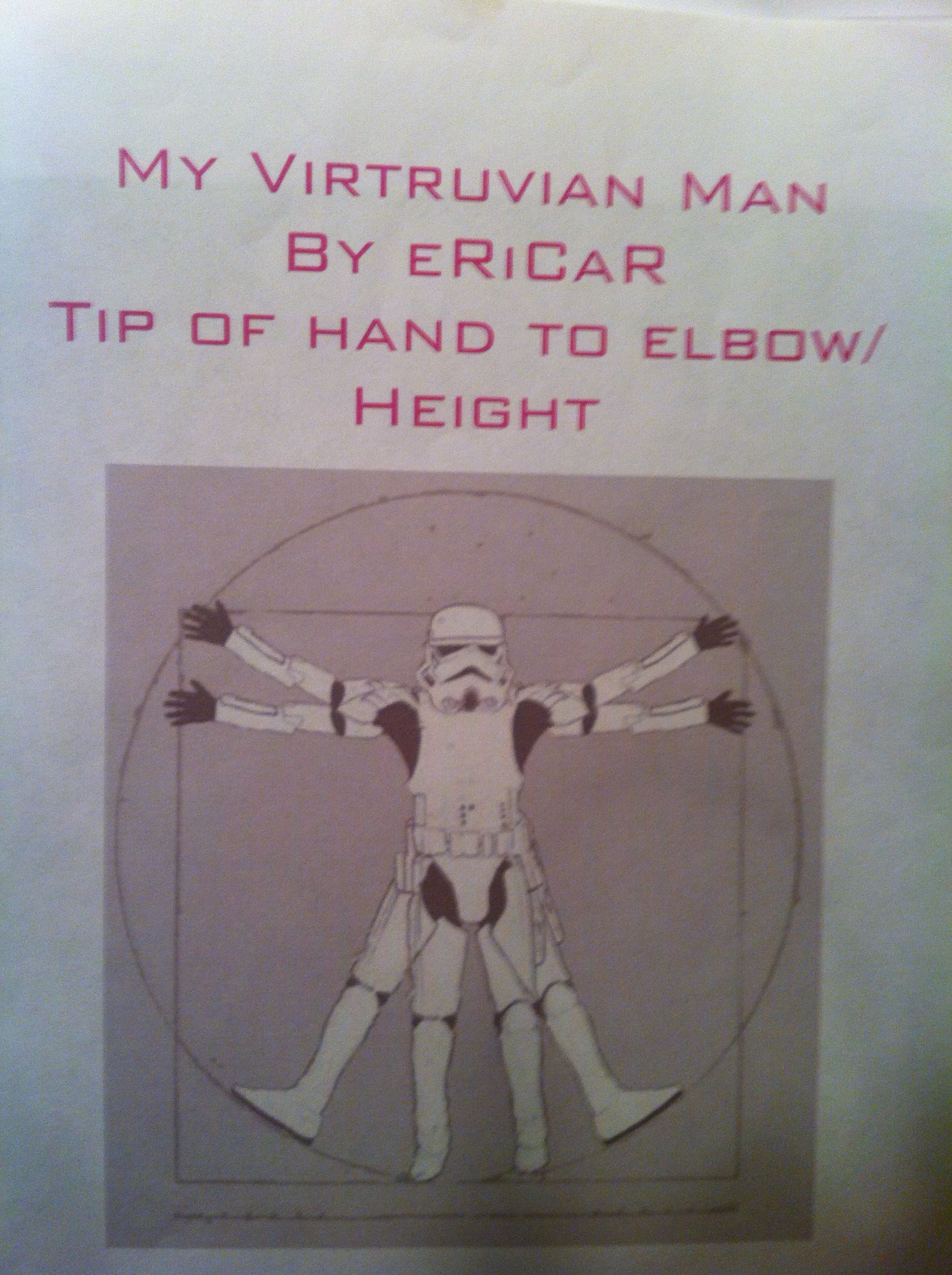
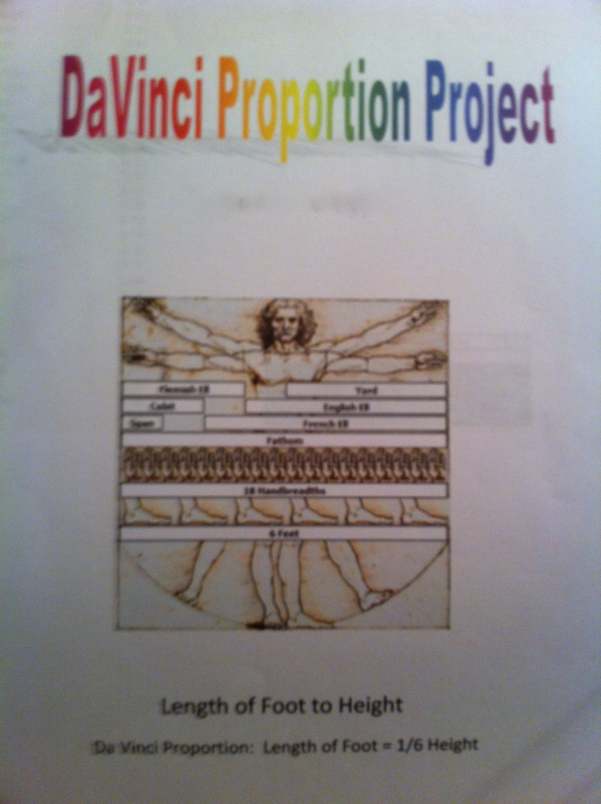
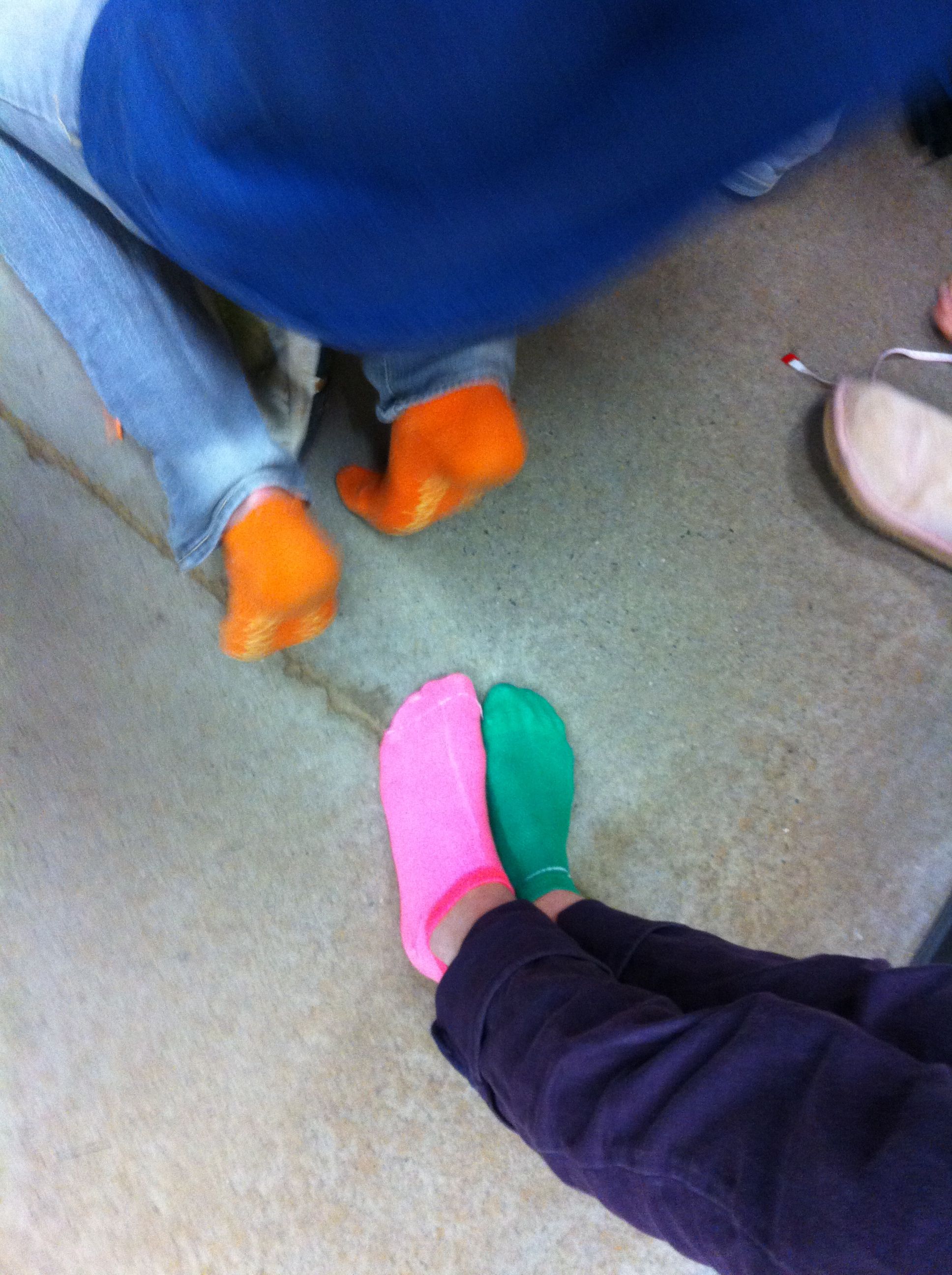
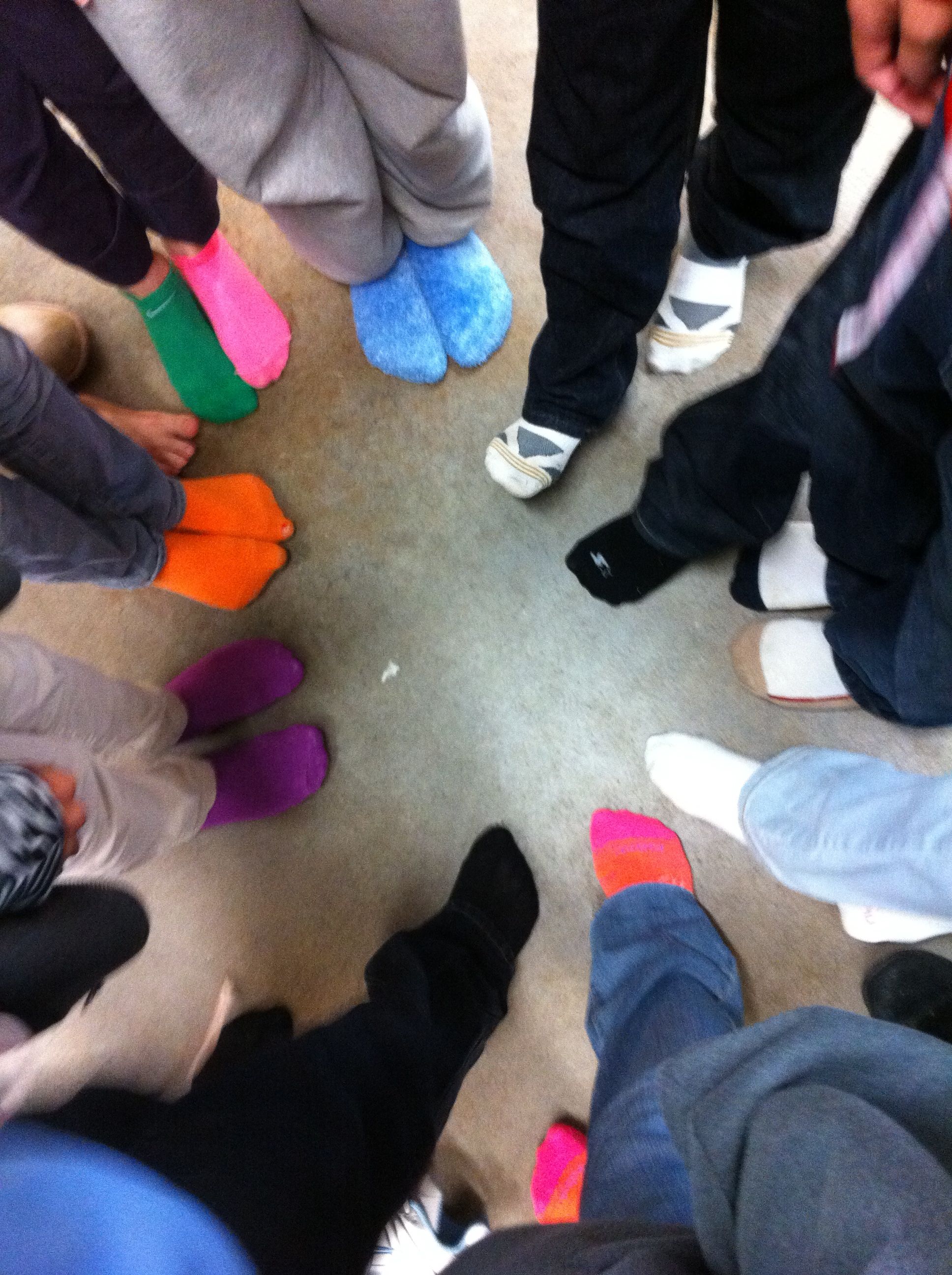
We talked about Da Vinci’s “ideal” body ratios in class. I picked four of these ratios for my students to analyze, arm span to height, hand length to height, foot length to height, and fingertip to elbow to height. We wanted their measurements to be as exact as possible, so they stood against the wall for their height and took off their shoes (cue great sock shots). After measuring themselves, they entered their measurements, as ratios, into a Google spreadsheet.
This was a wonderful extension of our previous Google spreadsheet work because I introduced my students to formulas. I showed them how to calculate formulas using the formula bar and the equal sign. Then, I showed them more advanced formulas using the formula menu. I had them enter their ratios into each cell so that they could still see their ratios, but a decimal was calculated for the cell. Best of all, they could still read their ratios by clicking on the cell and looking in the formula bar.
Mean, Median, and Mode
After all of the data was entered, I assigned each student a ratio to work with. Each student then duplicated the data sheet, deleted the columns of data that they were not working with, and sorted their column of data (sorting was a new skill as well). Sorting the data made the median and mode easier to calculate and their subsequent bar graphs more appealing to read. For the mean I had them use the AVERAGE( ) formula from the formula bar. To represent this data, they made a bar chart with each student and the mean, median, and mode.
Frequency Table
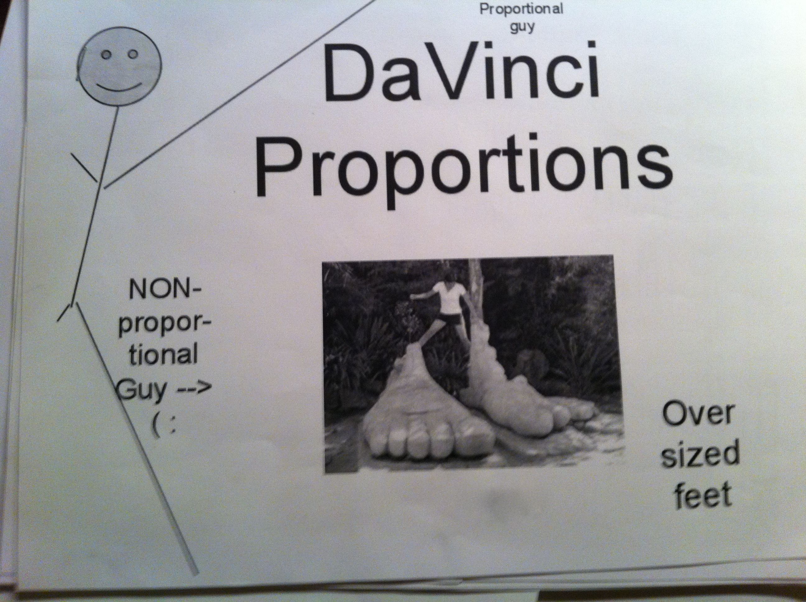
After calculating the data, we talked about the Da Vinci proportion for their particular body parts. They then entered that number into a frequency table that I had pre-typed onto the data sheet. They populated their frequency table with the number of students in our class that were under proportional, exactly proportional, and over proportional according to the Vitruvian Man. To illustrate the frequency table they created pie charts.
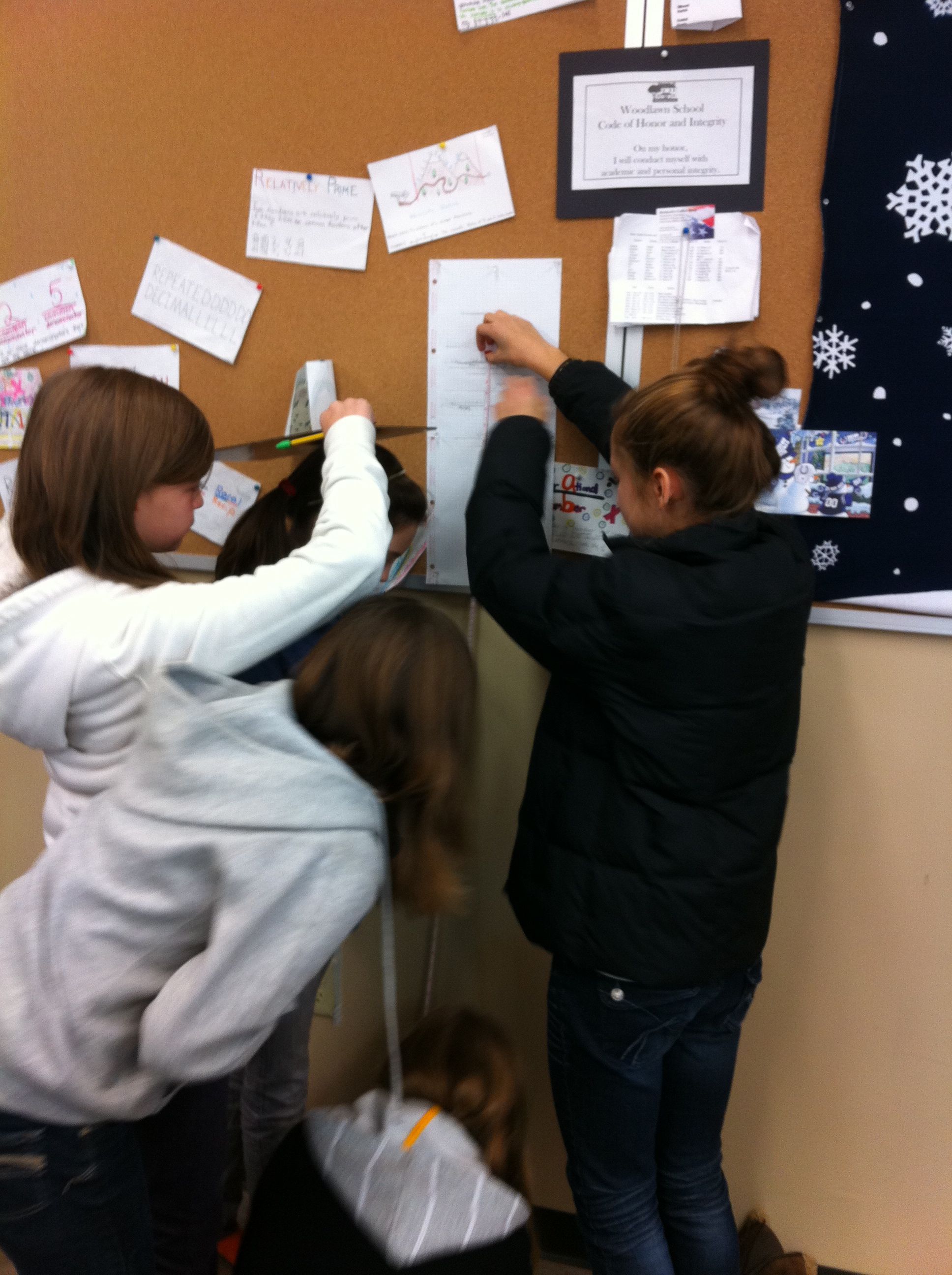
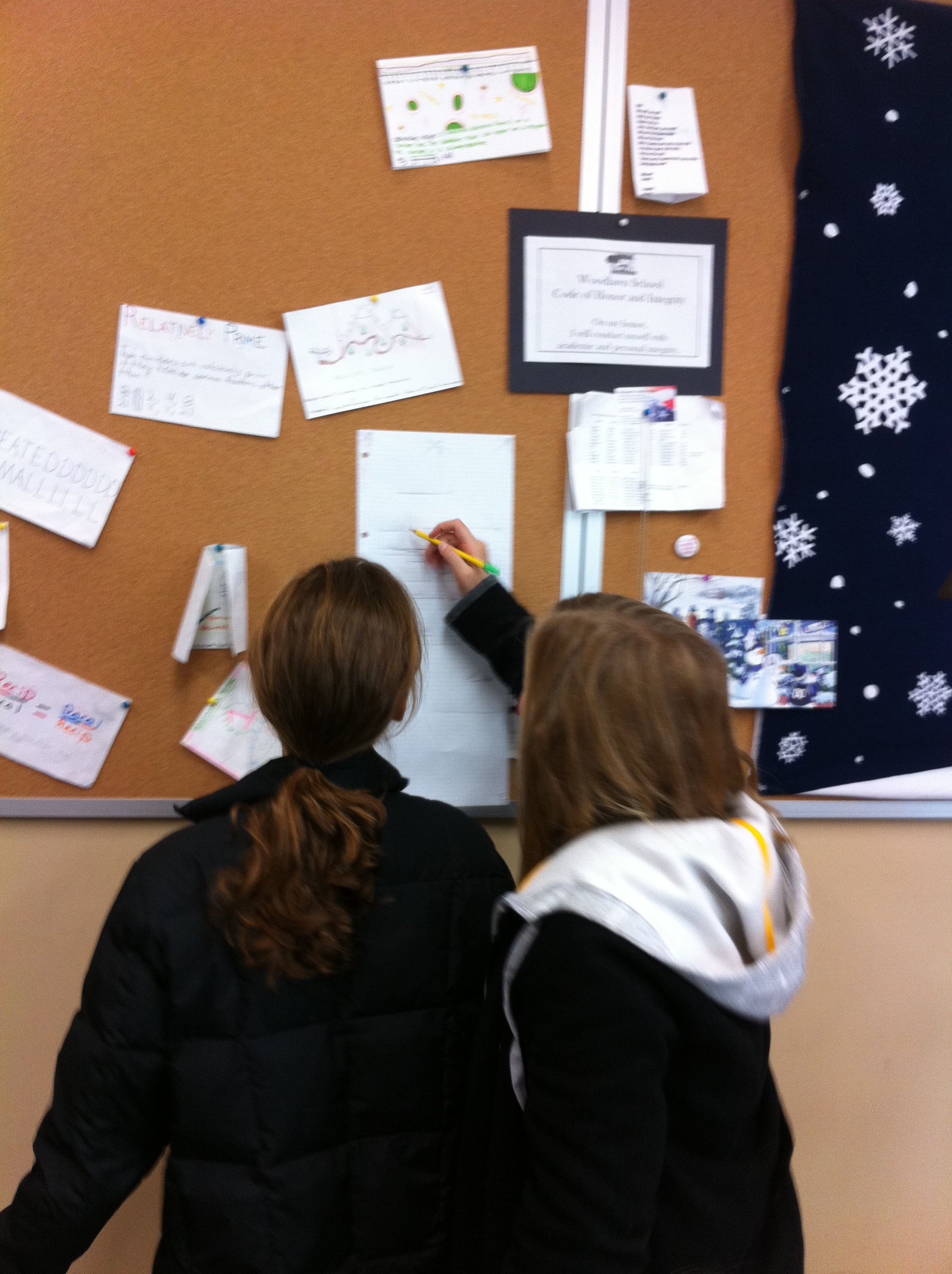
After their charts were complete they uploaded them to our Da Vinci Vitruvian Page on the wiki and explained their findings in the comments section.
To make this a grade-able project I had them print out their data sheet and charts as well as make a cover sheet. I showed them how to use Google word processing and Google drawing for the cover sheet (but that was optional). On the day they were due, the students presented their projects to the class. We discussed their findings as a class and talked about which measure of central tendency best represented their data. They summarized that they weren’t very proportional (according to Da Vinci) because they weren’t finished growing yet! But, they were most fascinated with interesting facts that they fond out about themselves (as in the fact that the person with the smallest hands did not have the smallest hands proportional to their height). It was great fun!

I enjoyed this lesson, and I love that you exposed your 6th graders to Da Vinci’s Man as I was just introduced to him as a 21 year old! I love that you got the students involved with making their own measurements, explaining potential errors, and setting up proportions to compare their measurements with those of other students. Kudos!