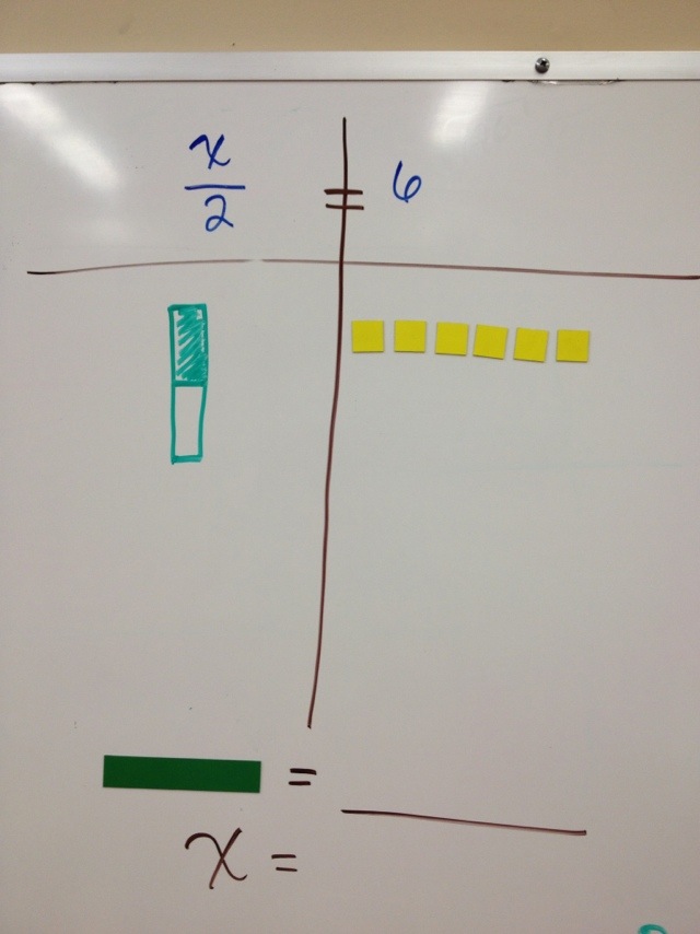
Why I love Algebra Tiles
6
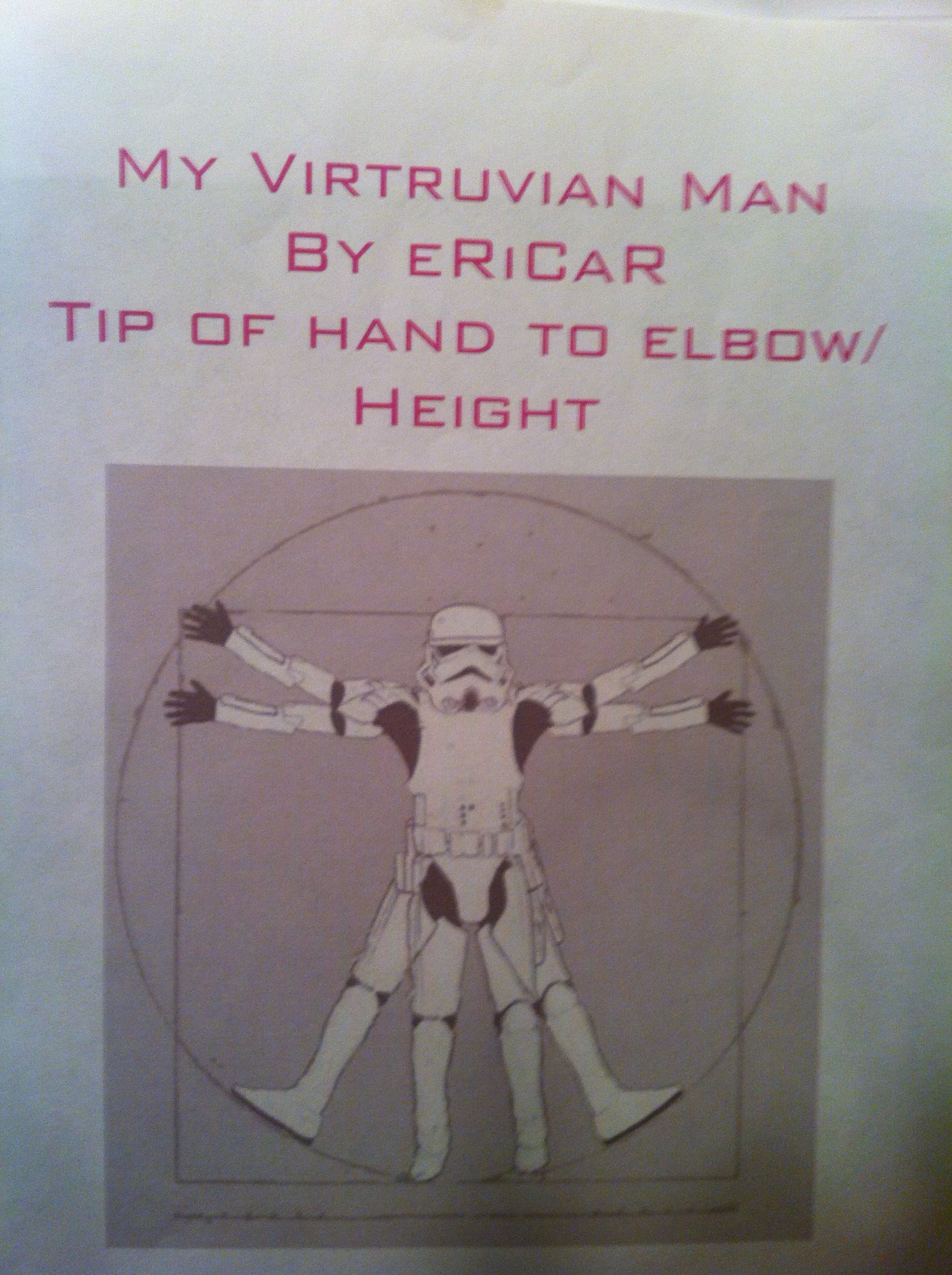
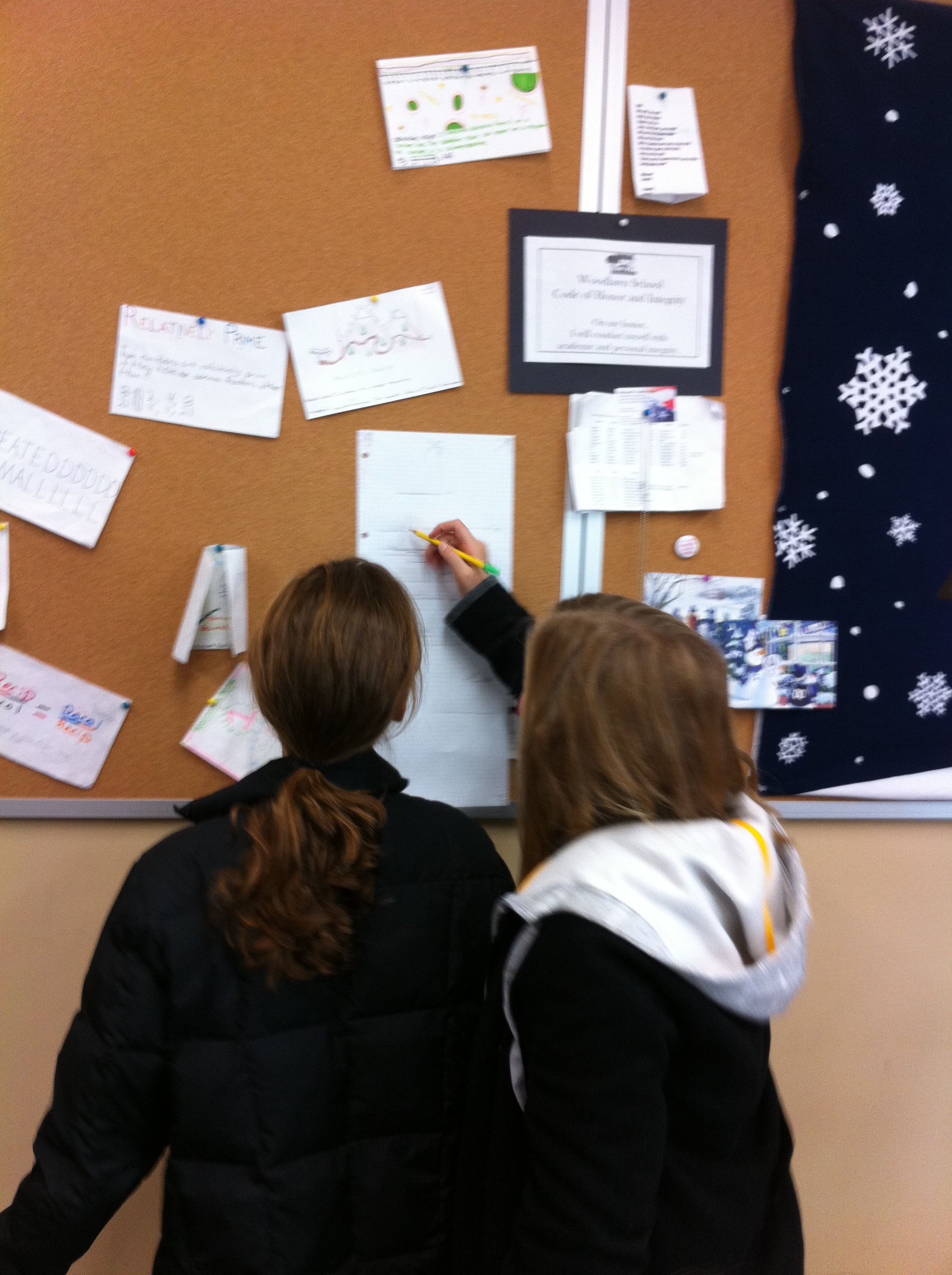
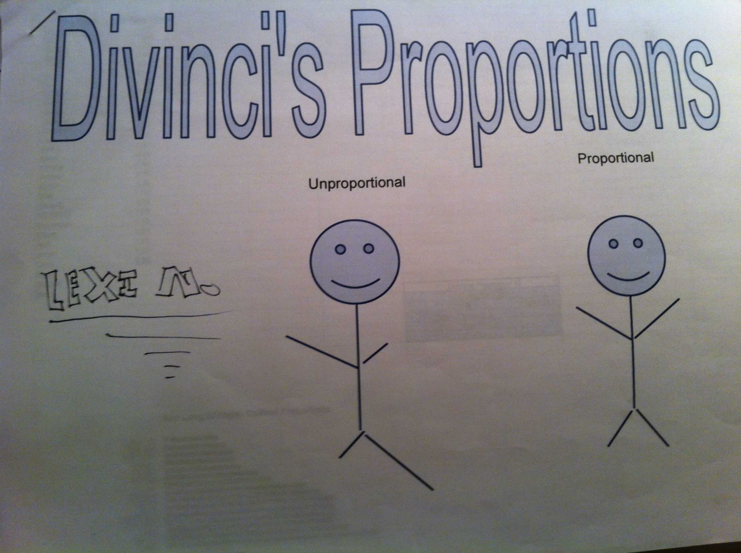
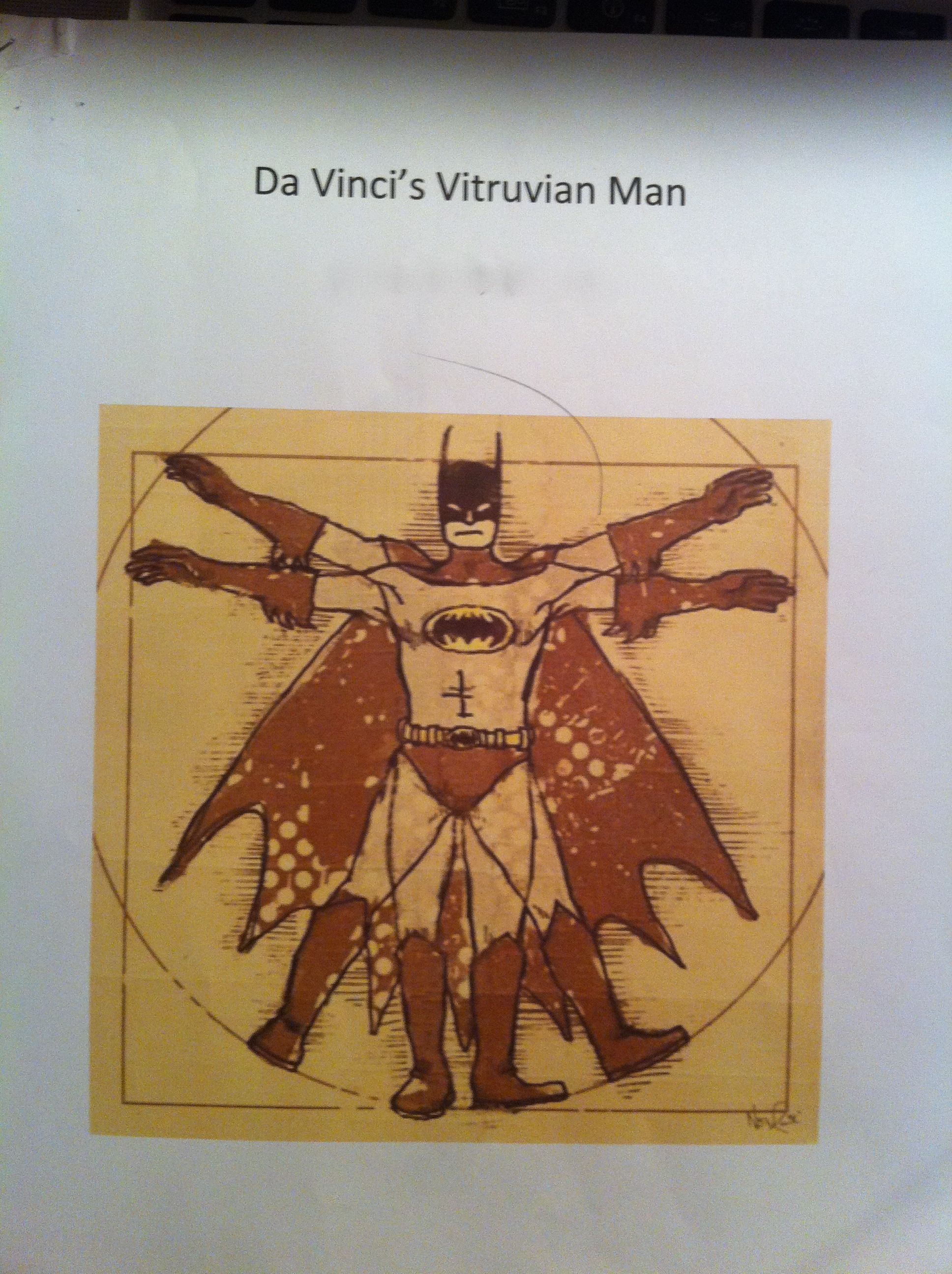
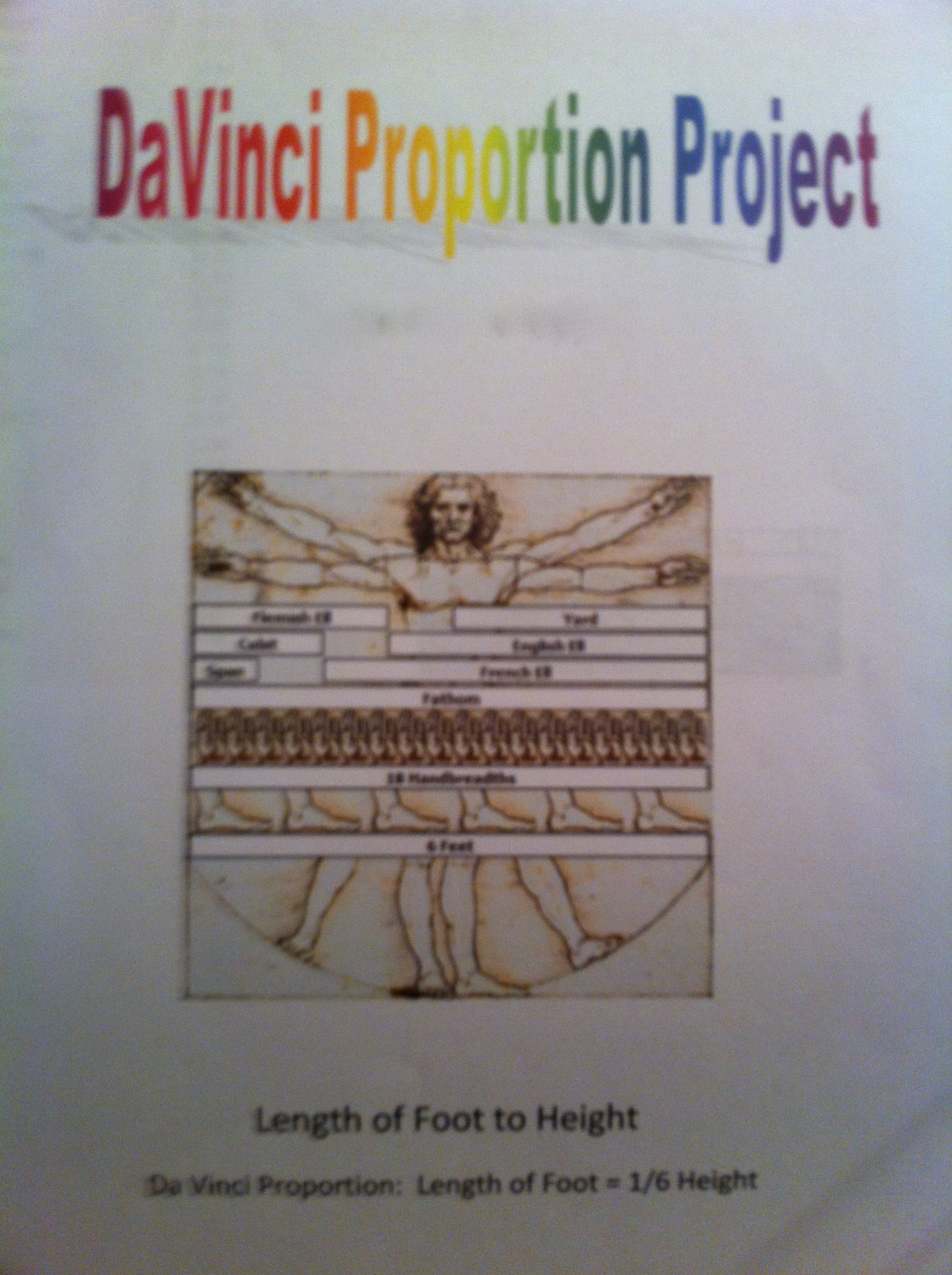
In our 6th grade curriculum students work on a large, interdisciplinary project on the Renaissance. After having so much fun in the Middle Ages, I couldn’t resist planning some fun with The Renaissance. Since we were studying ratios, I chose the ratios of Leonardo Da Vinci’s Vitruvian Man. To make it more relevant and interesting for the students, I had them measure and analyze their own body measurements to compare to the Vitruvian Man.
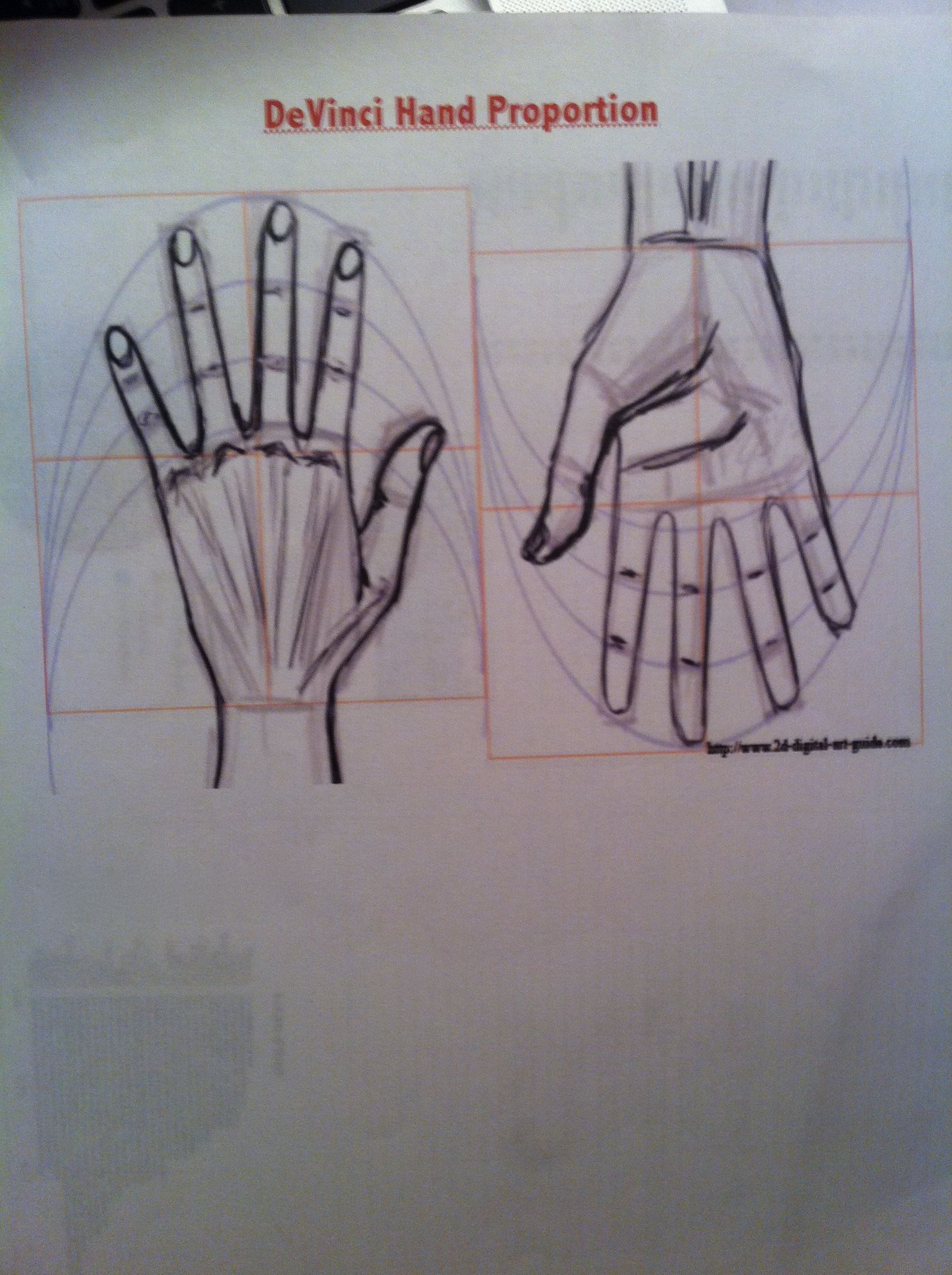
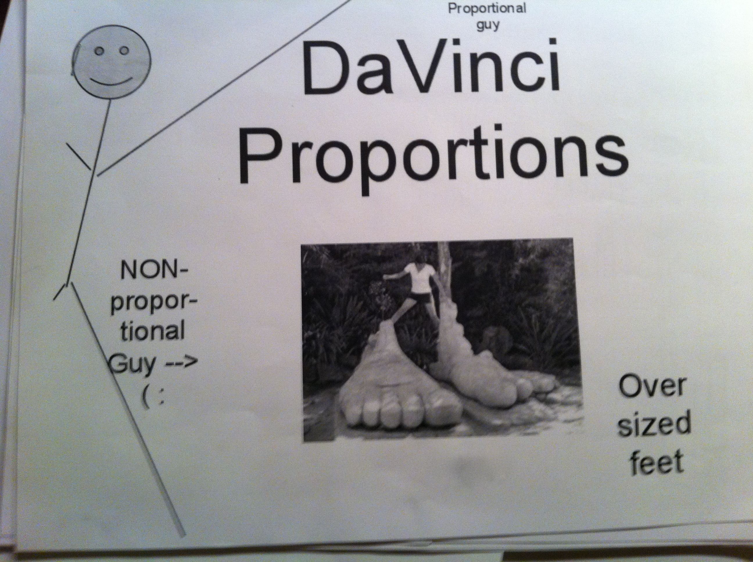
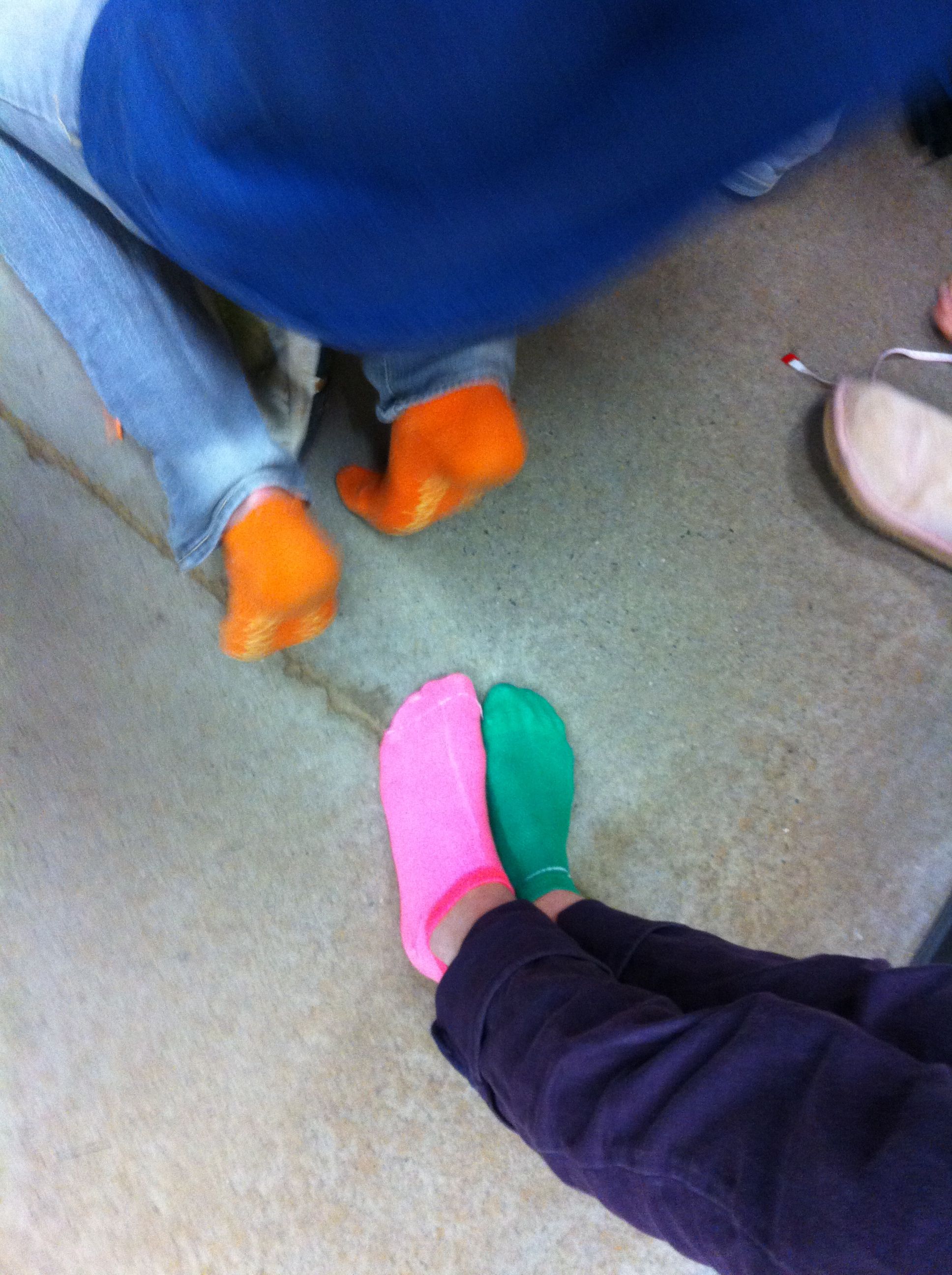
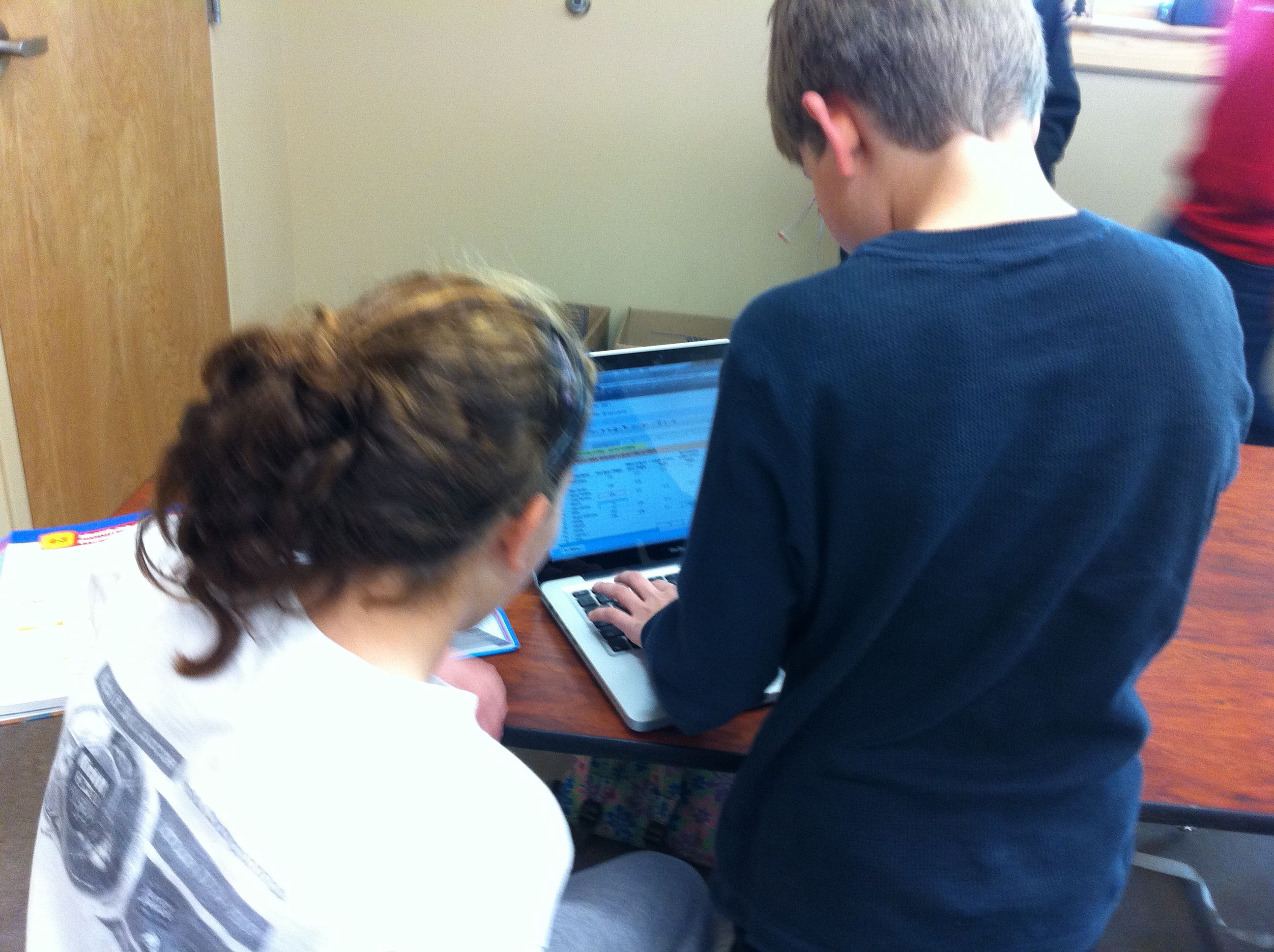
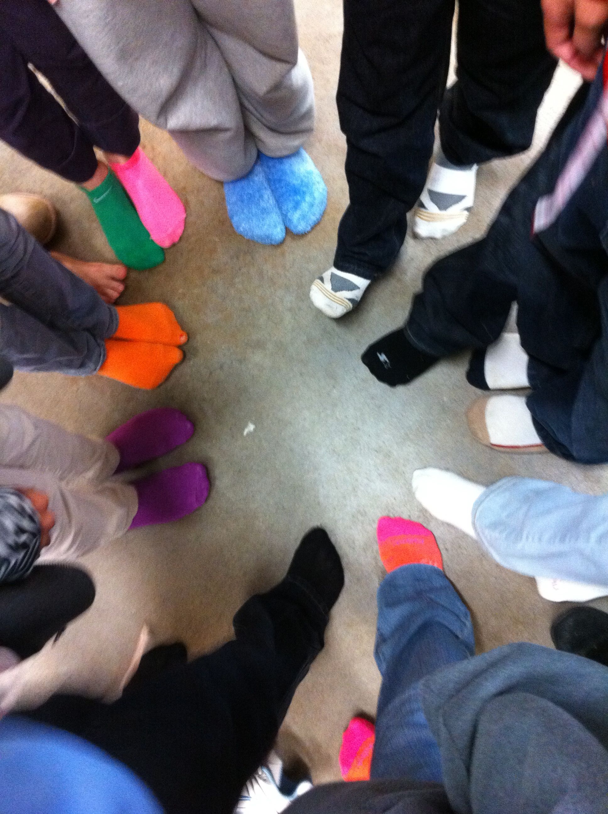
We talked about Da Vinci’s “ideal” body ratios in class. I picked four of these ratios for my students to analyze, arm span to height, hand length to height, foot length to height, and fingertip to elbow to height. We wanted their measurements to be as exact as possible, so they stood against the wall for their height and took off their shoes (cue great sock shots). After measuring themselves, they entered their measurements, as ratios, into a Google spreadsheet.
This was a wonderful extension of our previous Google spreadsheet work because I introduced my students to formulas. I showed them how to calculate formulas using the formula bar and the equal sign. Then, I showed them more advanced formulas using the formula menu. I had them enter their ratios into each cell so that they could still see their ratios, but a decimal was calculated for the cell. Best of all, they could still read their ratios by clicking on the cell and looking in the formula bar.
Mean, Median, and Mode
After all of the data was entered, I assigned each student a ratio to work with. Each student then duplicated the data sheet, deleted the columns of data that they were not working with, and sorted their column of data (sorting was a new skill as well). Sorting the data made the median and mode easier to calculate and their subsequent bar graphs more appealing to read. For the mean I had them use the AVERAGE( ) formula from the formula bar. To represent this data, they made a bar chart with each student and the mean, median, and mode.
Frequency Table
After calculating the data, we talked about the Da Vinci proportion for their particular body parts. They then entered that number into a frequency table that I had pre-typed onto the data sheet. They populated their frequency table with the number of students in our class that were under proportional, exactly proportional, and over proportional according to the Vitruvian Man. To illustrate the frequency table they created pie charts.
After their charts were complete they uploaded them to our Da Vinci Vitruvian Page on the wiki and explained their findings in the comments section.
To make this a grade-able project I had them print out their data sheet and charts as well as make a cover sheet. I showed them how to use Google word processing and Google drawing for the cover sheet (but that was optional). On the day they were due, the students presented their projects to the class. We discussed their findings as a class and talked about which measure of central tendency best represented their data. They summarized that they weren’t very proportional (according to Da Vinci) because they weren’t finished growing yet! But, they were most fascinated with interesting facts that they fond out about themselves (as in the fact that the person with the smallest hands did not have the smallest hands proportional to their height). It was great fun!
As much as I love teaching math, sometimes wish I taught social studies. History is so much fun!
In our 6th grade curriculum the students do a interdisciplinary project on the Middle Ages. They study the Middle Ages in Social Studies, read period books and fairy tales in Language Arts, create Middle Age art, and even learn popular dances from the Middle Ages in dance class. With all of the Middle Age fun coursing through the 6th grade, I could not be left out in math class!
The Land Of Matheval
I created “The Land of Matheval” for our Medieval Mathematics Unit. Matheval was a fictional medieval community comprised of my 25 6th grade students. I let all of my students pick a person from the Middle Age to become and research. We were studying percents, ratios, and rates so I wanted to look at the percentages of the different classes of people of the Middle Ages. To study rates, I decided to focus on the death rate of the Black Death across Europe.
Day 1: Percent of the Population
When people think of the Middle Ages, they often think of Kings, Queens, and knights. However, nobility was only about 1% of the population. In our class we investigated the percentage of the Medieval population that was nobility (1%), monks and priests (5-10%), and commoners (90%). We then took those percentages and applied them to our 25 6th graders to see how many of each class we would have. We had to do a little rounding and estimating so that we didn’t end up with half a person. We ended up with 1 member of nobility, 1 monk and 1 priest, and 22 commoners. The students were quite surprised that there was only one member of nobility among us!
Day 2: Draw Your Role
I had the students draw their role from a hat to decide if they would be nobility, clergy, or common. After drawing, we talked briefly about roles of commoners in the Middle Ages. They had been discussing this in more depth in Social Studies so were already familiar with the roles. The commoners got to pick a job. For part of their homework, they were to enter their job and provide a brief description of their responsibilities on a Google Document that I created. I told them that since we were such a small community they could not duplicate jobs.
Day 3: Estimate Your Chance of Survival
After they picked their roles I told them that we would be studying the Black Death. I explained that many people in Europe died from the Black Death. For part of their homework that night, they were to go onto their Google Docs and estimate their chance of survival according to the job that they had picked. This was when the students realized it was NOT a good time to have picked being a rat catcher!
Day 4: Rate of Death – The Black Death Arrives!
This day was one of those amazing teaching days that you wish you could have every, single day! I arranged for the art teacher to dramatically interrupt our class to announce that the Pestilence had arrived! What I didn’t know was that our art teacher was also the director of our school theatre productions OR that the social studies teacher would also join in the fun! About five minutes into class, the art teacher exploded through our door screaming, “The Pestilence has arrived!” before dropping dead in our doorway. She was then dragged out by their social studies teacher. This was immensely entertaining and made QUITE an impression on my students! With urgency, I told our students that our plans must stop at once today! We needed to stop everything and learn more about THE BLACK DEATH!
We discussed the spread of the Black Death throughout Europe by analyzing graphs and charts I had on a Powerpoint. We researched the population of Europe from 1347 to 1352 and discovered that 25 million people had died in 5 years. We then calculated how many people died each year, each month, and each day! As we continued on with our calculations, the numbers became more and more manageable (and thus realistic) for the students. They wanted more, so we then calculated how many people died each hour and finally, how many people died each minute.
We discovered that an average of about 10 people died every minute during that time period in Middle Ages. What did this mean for Matheval? For our small class of 12 it meant that we could all be dead from the Black Death in about 60 seconds. What could I do but set a giant timer on the overhead projector? At this, the students actually began to panic. My classroom became a flurry of voices, “The Black Death is here!”, “I don’t want to die from the Black Death!”, and “Let’s get out of here!” Then, they asked me something unexpected. They asked me, “Mrs. R, can we leave?” At this point, what could I tell them but, “YES! If you want to leave – GO!” At that, they all RAN out of the door, and kept running! They ran in all directions! They ran completely across the entire soccer field. And still, the time was counting down. When the timer went off I screamed out the door, “TIMES UP!! You are all DEAD!” This is when they did something else I did not expect, they all “dropped dead” right where they were. They were quite the spectacle! I wish I would have anticipated this, as I would have loved to post those pictures to this post! But, I was too caught up in the moment. What else could I do now but loudly sing, “Bring in your dead! Bring in your dead!” (You should never miss a chance for a Monty Python moment!)
When the class was back, seated and winded, we discussed what had happened. At hearing the Black Death was coming, what did all of my students do? THEY RAN. What happened to them anyway? THEY ALL DIED. But, what did they do in the meantime? They spread the Black Death across the entire Woodlawn Campus! We talked about how this was human nature, and many people in Europe probably reacted the same way that they did. They fled, and they spread the Black Death.
I then opened the Google Doc and we looked at their estimated chance of survival. After what we learned about the rate of death, we updated their percentages as a class.
It was a fantastic week, it was an amazingly fun lesson, and my students have not stopped begging for more activities like the Black Death!
I really cannot get over Google Docs. I just CAN’T! It is so amazing! I am having my 6th graders finish up their “How I Spend My Time” Google Spreadsheet project this weekend. All they had to do was enter in their decimals, insert a chart, and then print it out at home. Many students finished entering all of the information during class, so they just had to insert the chart and print at home.
There are two things that I love about Google Spreadsheets. One, as a student types, I can WATCH them type! Two, if they have questions, they can ask me i in the chat box. Then, I can give them suggestions and even look at their sheets to see what is going on.
So, it’s Sunday night and I am working now that the kids are in bed. I open the Google Docs to see how my students are doing. I pop into the chat box to ask them if they have any questions. I look at their work and help a few of them.
Here is a screen shot from my computer of all of the action (click on the picture to see everything including the chat box and the pie chart)! It’s amazing, and I love it! Everyone should try this!

Google Docs in Action!
I am used to teaching precalculus, not fractions. I was not really looking forward to teaching fractions to my 6th graders this year. In the high school setting, most students have severe adverse reactions to fractions. So, I decided that I had to do something FUN to save everyone’s sanity. I wanted an activity where they would want (or at least get) to practice tons of operations on fractions. Luckily, I am at a project based school and they highly encourage “thinking outside of the box”. So, I decided to take them “outside”!
We met outside on the basketball court, and each student could volunteer to shoot free-throws. They drew to see if they would throw 6, 8, or 10 shots. Then, we kept track of their shots on the “Free Throw Stats Sheet”.
After all of the kids had gone, we sat down at the picnic tables and …
After the first 4 steps, I had them just look at the players and estimate the top five shooters. Then, after we did the equivalent fractions, we actually ordered all of the players to see how close our estimates were. With the number of shots that we took, the kids were pretty accurate in their estimates before making the fractions equivalent. Ah, if I only had more class time in a day!
Back in the classroom the next day we compared ourselves to the local college team. The GREAT thing was that the percentages were listed in decimal form! That was such a bonus for me and really made them think about it more. (ie – The highest women’s free throw percentage was 0.806 – what is this percentage? Not 8.06 or 806 but 80.6 % – ahhh!!!)

Davidson College Women’s Basketball Stats

Davidson College Men’s Basketball Stats
Instead of all around groans when we did fractions, the kids seemed to really enjoy it. As we were shooting, the kids were doing much of the math in their heads and then saying things like, “I’m at 100%!” or “Two out of four – I’m at 50%. Hey! I’m as good as Shaq!!” Plus, sometimes it is just great to get outside on a beautiful fall day! : )
As always, suggestions welcome for improvement of this activity for next year!
