
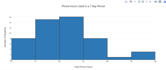
Wow. My Algebra 2 with Trigonometry students are actively using their phones (screen is lit and active) an average of 21 hours per week. Two students used their phones for about 35 hours in just one week.
We started our data unit last week. Wow, do I love our data unit! We start with box plots, then move to histograms and land on standard deviations. The calculations actually make so much sense, but they can be pretty dry. I love data analysis, so I wanted to spice it up using an idea I saw from Illustrative Mathematics. They compared the heights of women’s basketball and field hockey teams at the University of Maryland. Since we are in NC, I looked up the data for UNC athletes for my classes to compare. They really enjoyed it so I decided we should analyze their heights and sent them a Google Survey Form. Wow. High school kids love nothing more than data about their classmates! We compared boys to girls, and even class periods against each other. I had a blast! The data had become real! Instead of saying, “Outliers”, we could not say, “our outliers, Brian and Jairus” and the students had a visual point of reference.
This was so much fun I sent them another survey about shoe size, number of shoes, and number of hours they spent watching tv and playing video games in the last week. We were all ready to dig into this data the next day when we were thrown a curve ball. A student in my first class of the day showed us all how to find out how many HOURS we had all been on our iPhones in the past week, including listing all of the apps and how much they used each app for. STOP THE PRESS. Who the heck cares about shoe sizes when we could see not only how much our friends have been on their phone, but what their top app was! We instantly started adding up and analyzing the data. And it was incredible!
We found out that my students use their phone an average of 21 hours per week. This is SCREEN time, when they are actively engaged in their screens, not apps running in the background.
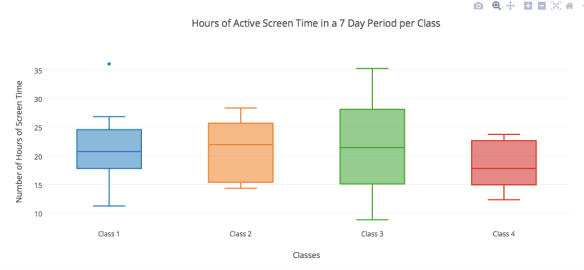
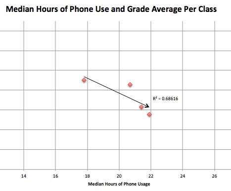
After seeing this data per class, I wondered if this much screen time was affecting their grades. Because of some outliers in some classes, I decided to use median phone usage instead of the mean. I compared it again the average grades for each class. With even just a few data points, it appears to be negatively correlated. Of course talking about the averages does not accurate reflect each student. To get the actual regression I would need to correlate each students phone hours with their grade average. Maybe this summer I will have time to look at it. This quick chart does make me wonder. As a high school teacher and a parents of teenagers it makes me very concerned.
We had so much to analyze that we all leaned on Plotly for help. What an amazing, easy to use, and FREE program. And what an amazing data unit.
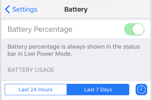
To see the screen time, students must have updated their phones, and they need to have an iPhone. I am sure that other phones probably provide this as well, but we could not find it. Go to Setting, Battery, Battery Percentage, Last 7 Days, then hit the little clock icon. Prepare to be shocked.

Wow. That’s crazy. Make me wonder how often my middle school students are on. Looks like a great thing to do in our data unit to end the year! Thanks for sharing!
I just showed my daughter how to look at this on her own phone, and she was stunned at some of her choices. And, frankly, of my own choices too. Wow! Can’t wait to try this with the students.
For a good while, I have been looking for a project to do with this type of data (that’s how I found this). What is crazy to me is that your screen time data from 2016 is going to be shockingly low compared to what it is in 2024. I have not collected data for this (yet), but through some conversations, I estimate some students average about 50-60 hours per week on their phone. They may be outliers, but I would not be shocked if the mean is closer to 30 hours per week.