Linear Equations – Plotting and Predicting Measurements

Given someone’s height, I wanted my students to see how well they could predict other measurements (like head circumference, arm span, foot length, and hand length).  They used measurement data that they had collected (their very own measurements), and then used scatter plots and lines of best fit for their predictions.

We are learning about graphing, including functions and linear equations.  They plotted ordered pairs the first day, and then learned about functions.  Now it was time to investigate linear equations.  This is an amazing part of mathematics not only because it is so interesting, but also because it is useful!

Plotting the Data

Plotting the Data

I have been told that students grow like weeds in middle school.  Since the beginning of the school year, my students have been recording their measurements every couple of months.  They measure their height, arm span, head circumference, foot length, and hand length in inches.  I had them fill out a Google Docs Survey which then organizes their data into a Google Docs Spreadsheet for us.

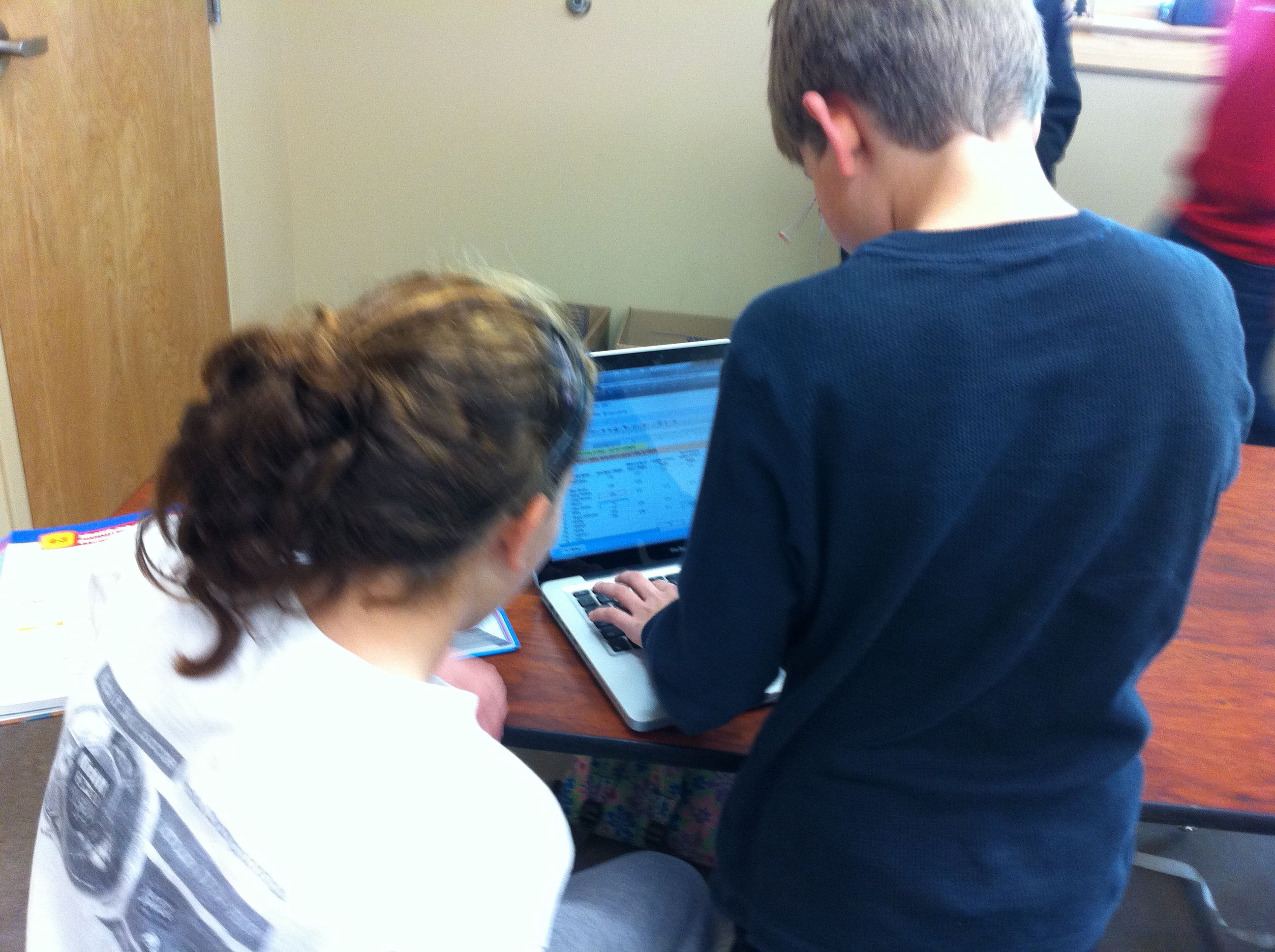
In class I had the students measure each other again so that recent measurement data could be included in our data set.  For homework, they were to enter their measurements onto the survey and measure each member of their families height in inches.  At the start of class I gave every student a piece of graph paper, a ruler, a worksheet, and a computer.  I then assigned each group a data set to analyze (head, arm span, foot, or hand).  We were making all predictions based on height (the x-axis), so everyone kept the height column and one more data set (the y-axis).  They duplicated the GDoc data sheet and deleted the columns of data that they were not assigned.

In order to determine the scale for the x-axis and y-axis, they calculated the range for their data sets.  This led to a great discussion about how this range would only make a good scale if we were just measuring middle school students.  But, we also wanted to be able to predict the measurements of people of other ages and sizes.  So, we expanded our range to find a more optimal scale that would cover all of the people that we had measured the night before.  We then discussed scale and counted the grid lines on our graph paper to determine how to number our axes.

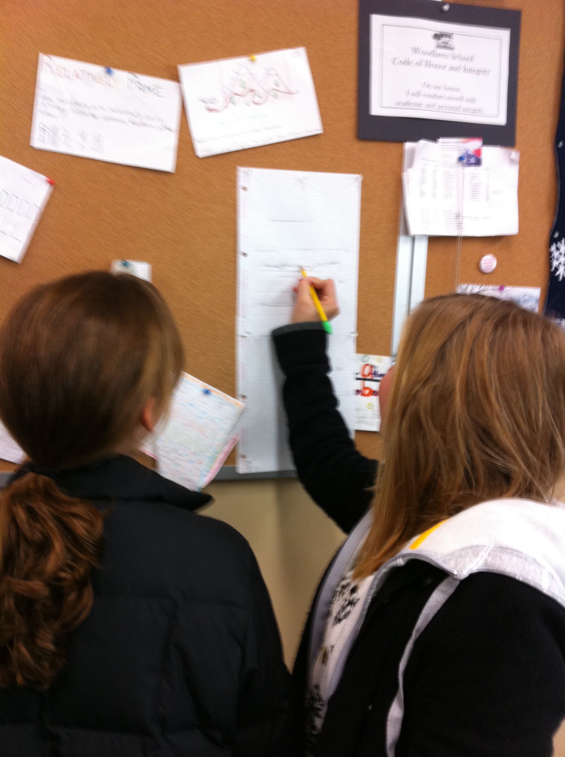
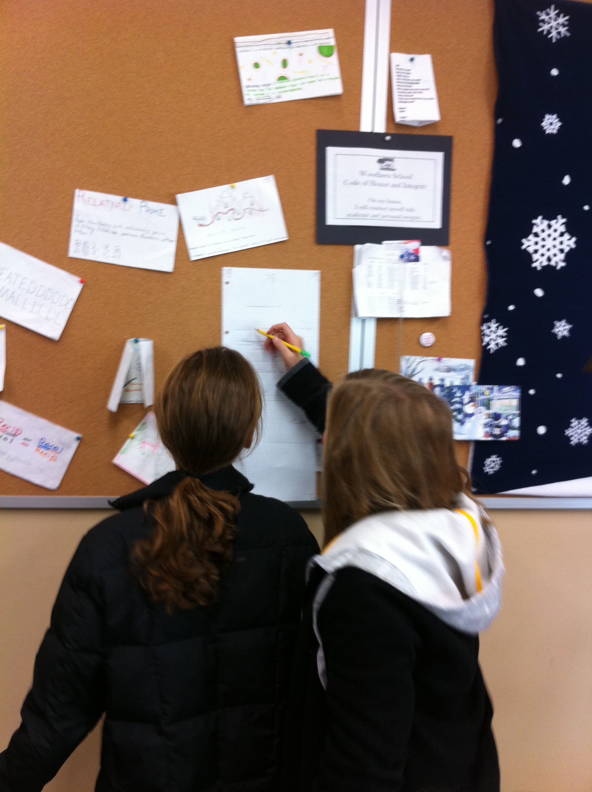
After our axes were labeled and numbered it was time to plot points.  I let them plot for about 10-15 minutes, which was not near enough time for all of our data!  This needs to be a two day activity next year to get the most out of it.  I explained the line of best fit, and showed them a picture of a scatter plot with a line of best fit drawn on it (from Excel).  I had them draw what they thought was a line of best fit through their data points, and instructed them to draw their line across the entire paper so that they could make predictions for various heights.  **  When drawing their lines, be careful to instruct them not to cross the x-axis, as then their line will intersect the y-axis below 0.  People cannot have negative measurements! **
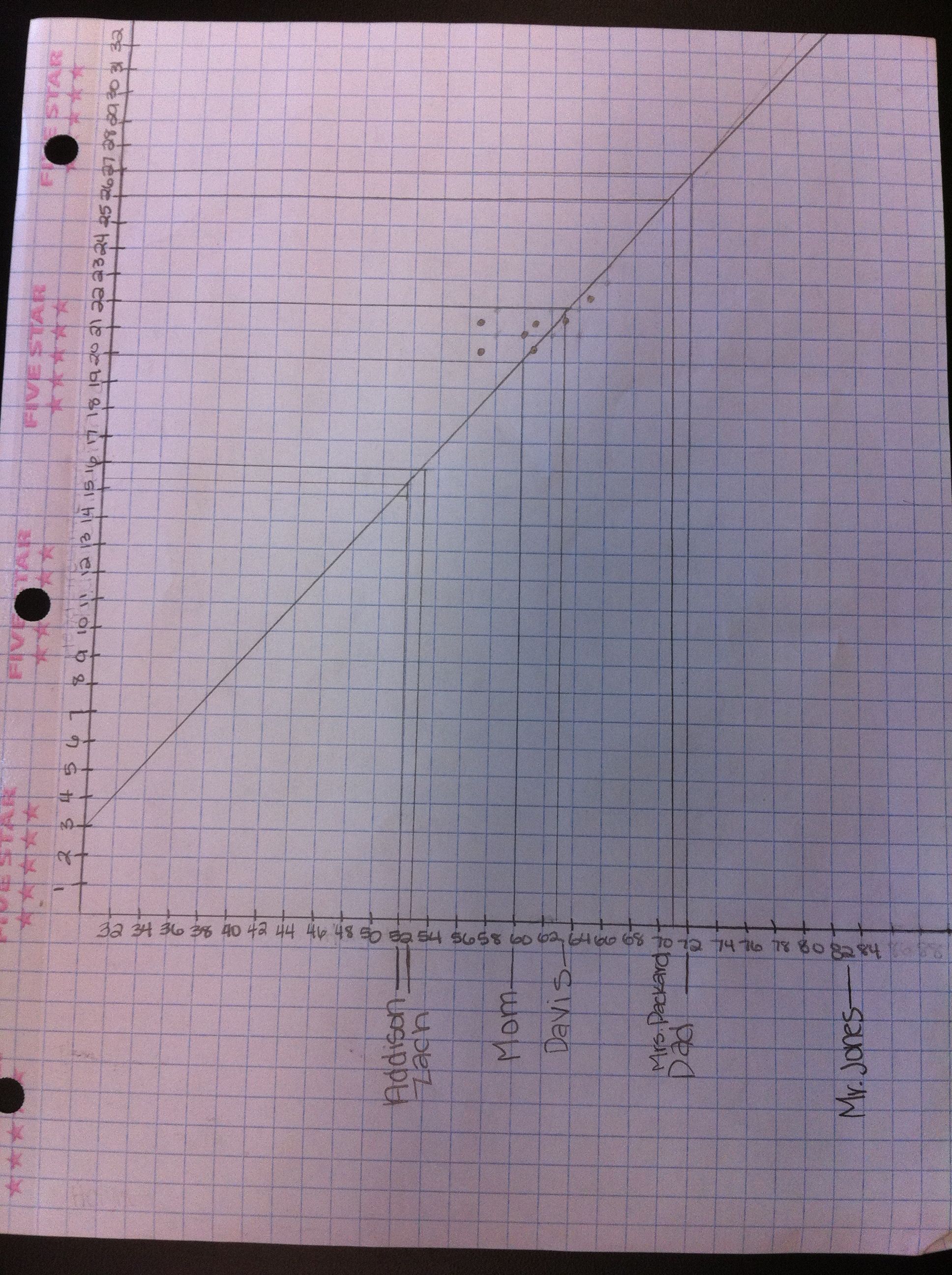
To show them how to make their predictions, I had them fill in the height data that they had collected the night before from members of their family.  They plotted their family members height on the x-axis and labeled them.  I illustrated how to go up to the line of best fit, then go over to the y-axis to predict their family member’s other measurement.  They recorded this and for homework tonight they will find the actual measurements of their family to compare.

Enter Mystery Guests!
This was our favorite part!  I arranged for 4 – 6 mystery guests to come in at this time.  I wanted to measure people of varying heights and ages.  Our mystery guests included students (1st graders, a 3rd grader, a 7th grader, some seniors) and teachers from our school.  We measured their heights and then predicted their other measurements using the students lines of best fit.  While the students worked on their predictions, I had the mystery guests measure each other to find their actual measurements.  The guests then walked around the room to see how close the students predictions were.

The mystery guest portion was not only the most fun, but also the most informative piece of the lesson.  We were able to discuss why some measurements were more accurate than others.  They discovered that a big factor overall was that our data came only from middle school aged students.  Thus, our data wasn’t as accurate of a predictor for people that weren’t “middle school size”.  Also, they determined that some factors were much better predictors overall, such as arm span.

For homework, they were to go home and measure their family members actual measurements to see how close their predictions were.  I also had the students write a reflection on our class wiki.

We had so much fun with this activity but it was a real crunch to get it done in 50 minutes!  I will definitely do this again next year, but I will take two full class periods.  I would like to go deeper into numbering the axes, spend more time plotting the points, and have more time at the end to analyze the results.  Next year we will analyze our data, spend more time plotting points, and then work on our families measurements the first day.  Our mystery guests will open day two!  From reading the students reflections, it was clear that they really enjoyed this activity too!  Win-win!

Marvelous Math Stations

Hi!  Be sure to follow me on Twitter for more updates!  I am @jreulbach.  🙂

This was the BEST review activity I have ever done!
I even overheard a 7th grade boy say, “Wow, this is FUN!”  That my friends, is hard to do – especially in math class when we are working on solving multi-step inequalities!

I love math stations because:

  1. They allow students to work on their own level, at their own pace.
  2. Students are doing all of the work and problem solving the entire class period instead of watching and copying what I do.
  3. They allow me to work individually with each student as needed.

This is an activity that I use to review a concept or several concepts.  I make about 8 stations with two problems in each station.  I give each student a blank Math Stations Worksheet .  Then, I assign students to the first four stations.  Station 1 has problems that are less difficult, and as students progress through the stations the problems get more difficult.  Students that need more help start out in station 1 with easier problems.  More advanced students are assigned to higher stations according to their ability level.

When students finish with a station, they come to me to see if their answers are correct.  If they are correct, they advance to the next station.  If they are incorrect, I work with the student and then they try again.  They cannot move on to the next station until they master the problem in their current station.

I usually put basic problems or review problems in Station 1.  This is a great way to catch students up who have been absent or are just having a difficult time with a concept.  In levels eight and nine, the problems are challenging.  Not all students will make it to levels eight or nine.  But, if they are able, it allows them to work challenging problems instead of being bored doing the same type of simple problems over and over again.

I also have students carry an index card with them from station to station.  When I help a student with a concept (like – remember to reverse the inequality sign when multiplying or dividing by a negative), they can jot it down on the card.  At the end of class, this card has reminders of the things they had the most trouble with.  I have noticed that most students make the same errors over and over.  Hopefully they will use this card when they get stuck or can’t remember what to do.

Edit: After sharing this with Kristen Fouss after posting, she shared this fabulous activity with me!  I loved her color and her cute idea!  All I had to work with was colored index cards, so I colored coded my stations with the index card answers.  This way they can easily (read quickly) find the answers when they are finished with each station.  Thanks Kristen for inspiring me again!  : )

For quick and easy math station creation using a worksheet, read Quick and Easy Math Stations (aka Pimp Your Worksheets).  🙂

Summary – After the Activity:

I have done station before, but this was the first time I did it according to ability level and with progressively harder problems.

Yes, the stations did get crowded sometimes.  And yes, they are middle school students so they did actually fight over the questions and the answers when a station got too crowded!  What do I think about that?  Hello – they are FIGHTING over math problems!  Consider my job DONE.

They wrote great notes on their individual notecard.  However, they kept leaving it behind at other stations.  Anyone have a solution for that?

They worked like crazy the entire period.  It was loud, it was crazy, it was learning at its best, it was FUN!  I walked around and helped when needed.  Some students needed more help than others.

Some students did all 18 problems!  I couldn’t believe it.  There was only about 5 minutes of class left, so I told the finished students to use their work and find someone to help.  I was the happiest when a student who started in level 1 zoomed through all of the levels and finished all 18 problems before the end of class!  Success is a powerful motivator.

Their suggestions:  At the very end, I asked for their suggestions on how to make this activity better in the future.  They said:

  1. Make more copies of the problems and answers so we don’t have to share (fight) for them.
  2. Less problems, but make them harder
  3. More problems, make them easier
  4. Let us work together when we have a question (I told them they had to figure it out on their own or ask me, sometimes when another student helps them they tell them too much and the student being helped doesn’t learn.  I wanted to make sure everyone was learning).
  5. Bring candy for when we are all done!

Off to a foldable and speed dating tomorrow!

Da Vinci’s Vitruvian Man – Ratios, Mean, Median, Mode & Frequency

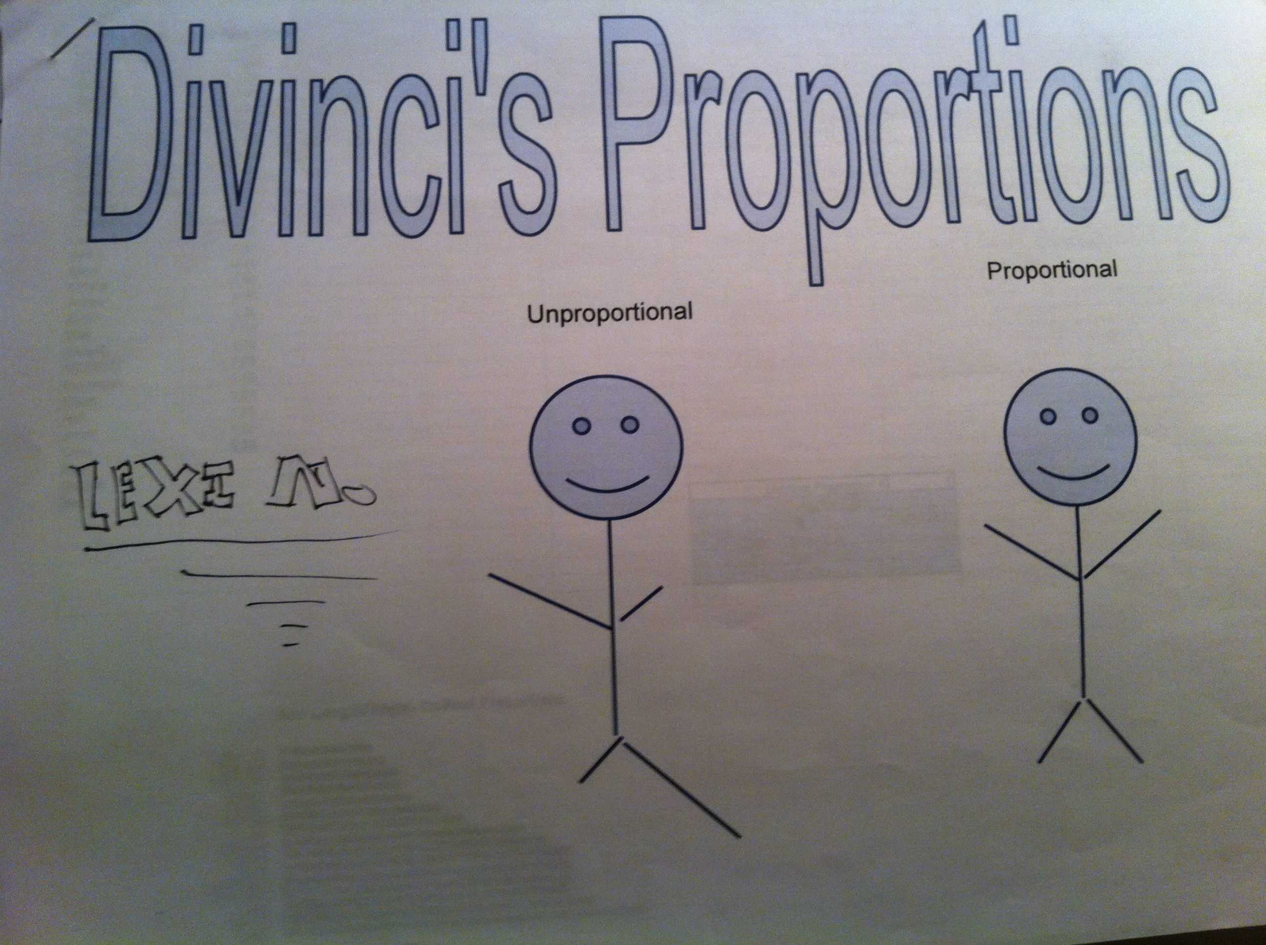
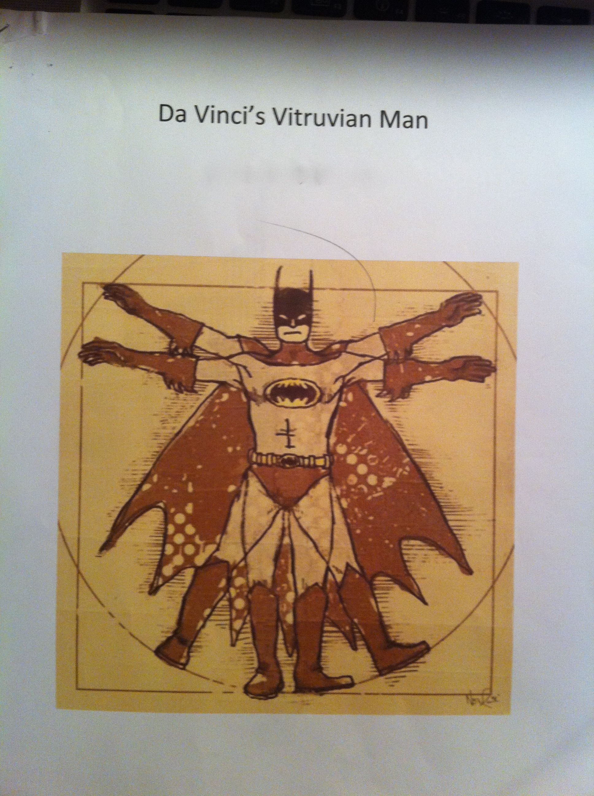
In our 6th grade curriculum students work on a large, interdisciplinary project on the Renaissance. After having so much fun in the Middle Ages, I couldn’t resist planning some fun with The Renaissance. Since we were studying ratios, I chose the ratios of Leonardo Da Vinci’s Vitruvian Man.  To make it more relevant and interesting for the students, I had them measure and analyze their own body measurements to compare to the Vitruvian Man.

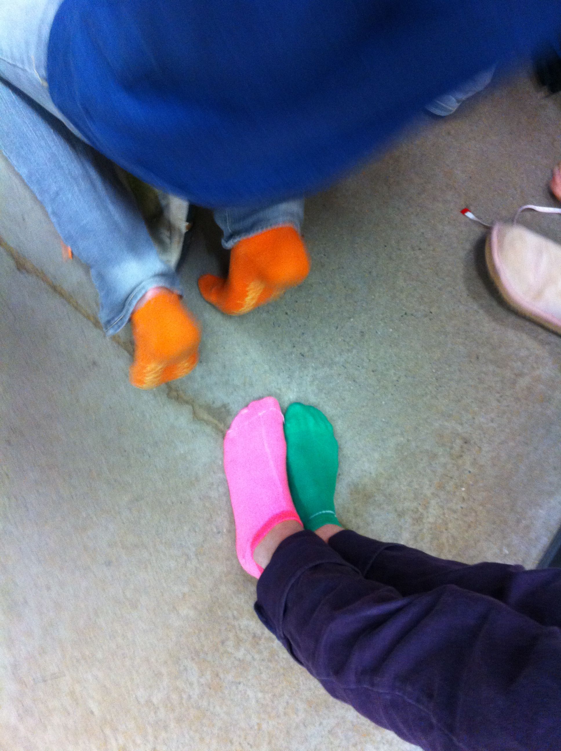
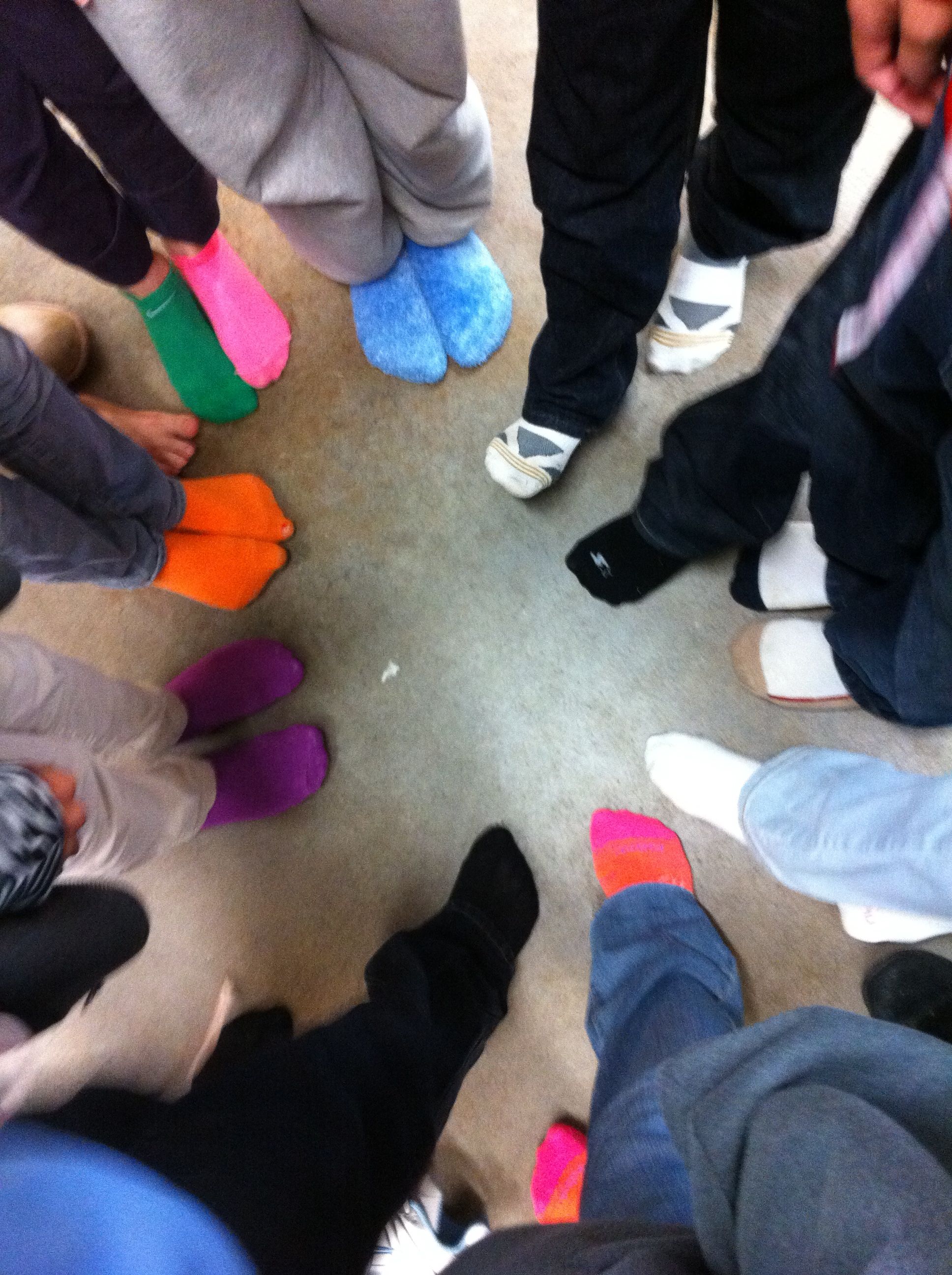
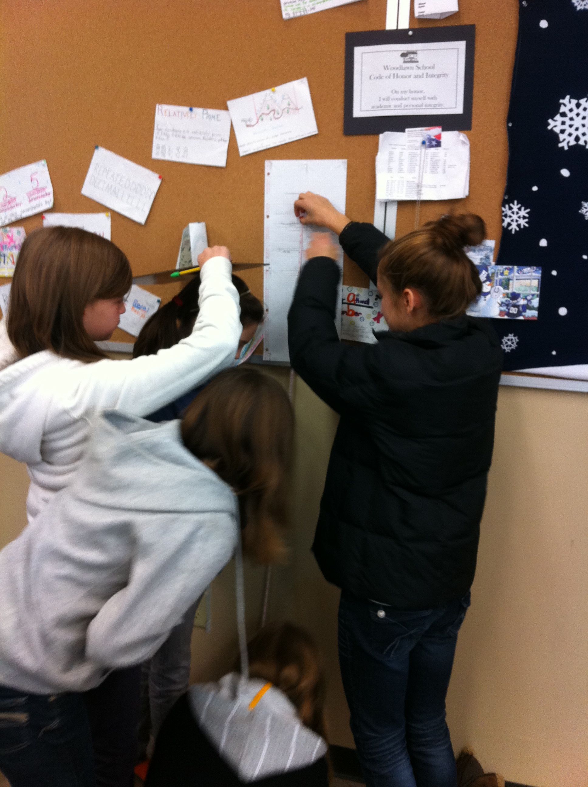
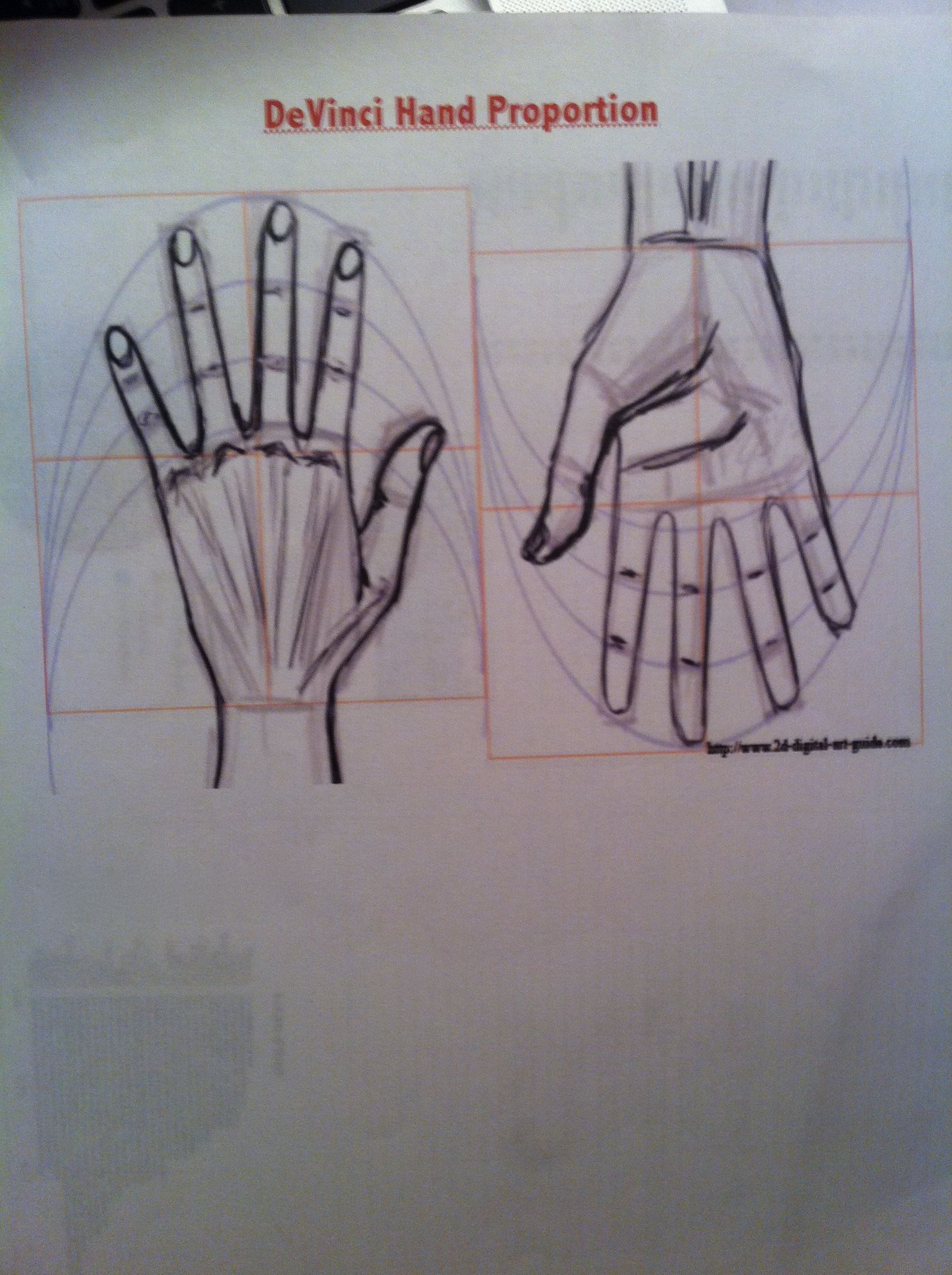
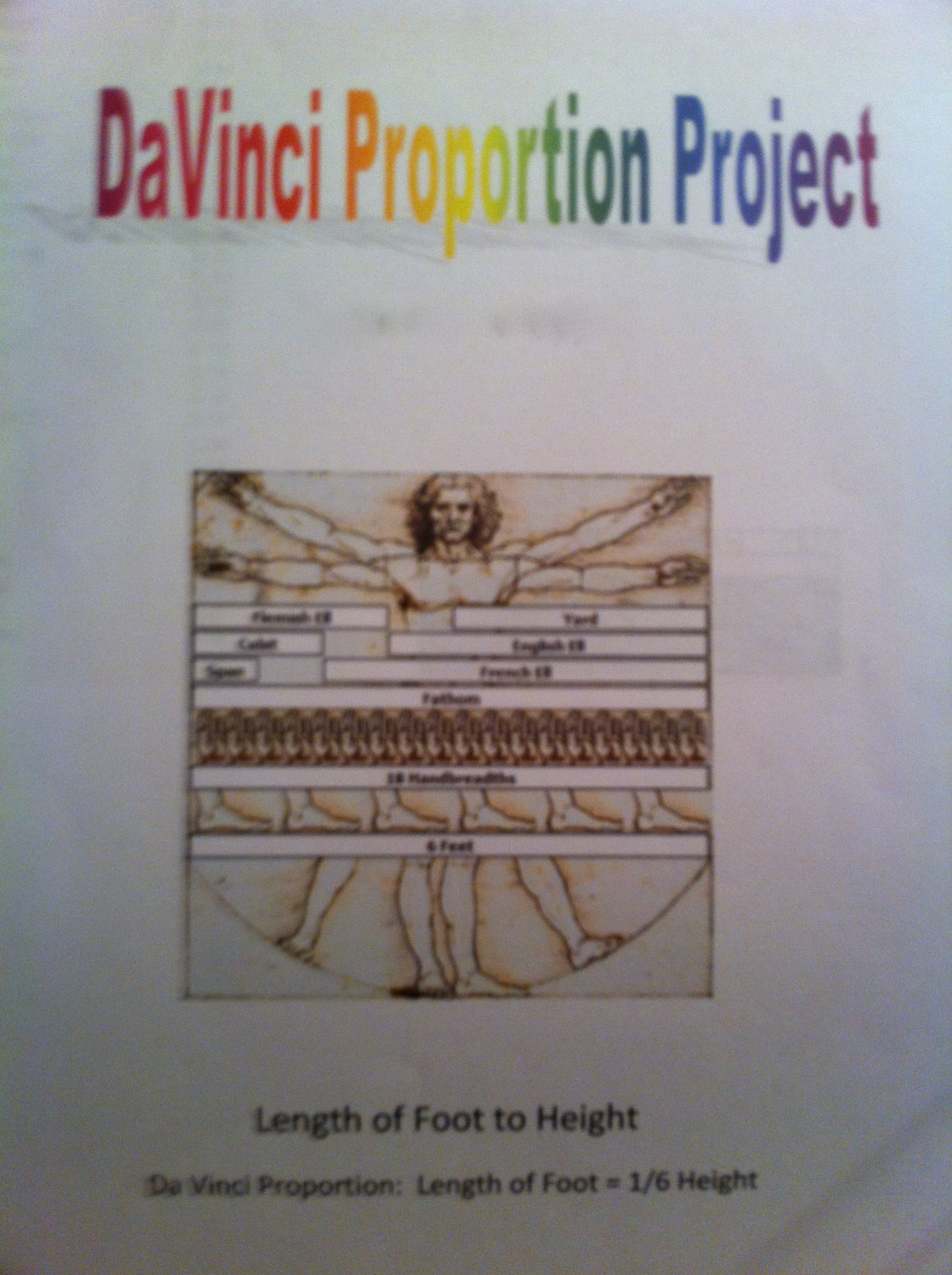
We talked about Da Vinci’s “ideal” body ratios in class.  I picked four of these ratios for my students to analyze, arm span to height, hand length to height, foot length to height, and fingertip to elbow to height.  We wanted their measurements to be as exact as possible, so they stood against the wall for their height and took off their shoes (cue great sock shots).  After measuring themselves, they entered their measurements, as ratios, into a Google spreadsheet.

This was a wonderful extension of our previous Google spreadsheet work because I introduced my students to formulas.  I showed them how to calculate formulas using the formula bar and the equal sign.  Then, I showed them more advanced formulas using the formula menu.  I had them enter their ratios into each cell so that they could still see their ratios, but a decimal was calculated for the cell.  Best of all, they could still read their ratios by clicking on the cell and looking in the formula bar.

Mean, Median, and Mode

After all of the data was entered, I assigned each student a ratio to work with. Each student then duplicated the data sheet, deleted the columns of data that they were not working with, and sorted their column of data (sorting was a new skill as well).  Sorting the data made the median and mode easier to calculate and their subsequent bar graphs more appealing to read.  For the mean I had them use the AVERAGE( ) formula from the formula bar.  To represent this data, they made a bar chart with each student and the mean, median, and mode.

Frequency Table
After calculating the data, we talked about the Da Vinci proportion for their particular body parts.  They then entered that number into a frequency table that I had pre-typed onto the data sheet.  They populated their frequency table with the number of students in our class that were under proportional, exactly proportional, and over proportional according to the Vitruvian Man.  To illustrate the frequency table they created pie charts.

Google Spreadsheet Data Sheet

After their charts were complete they uploaded them to our Da Vinci Vitruvian Page on the wiki and explained their findings in the comments section.

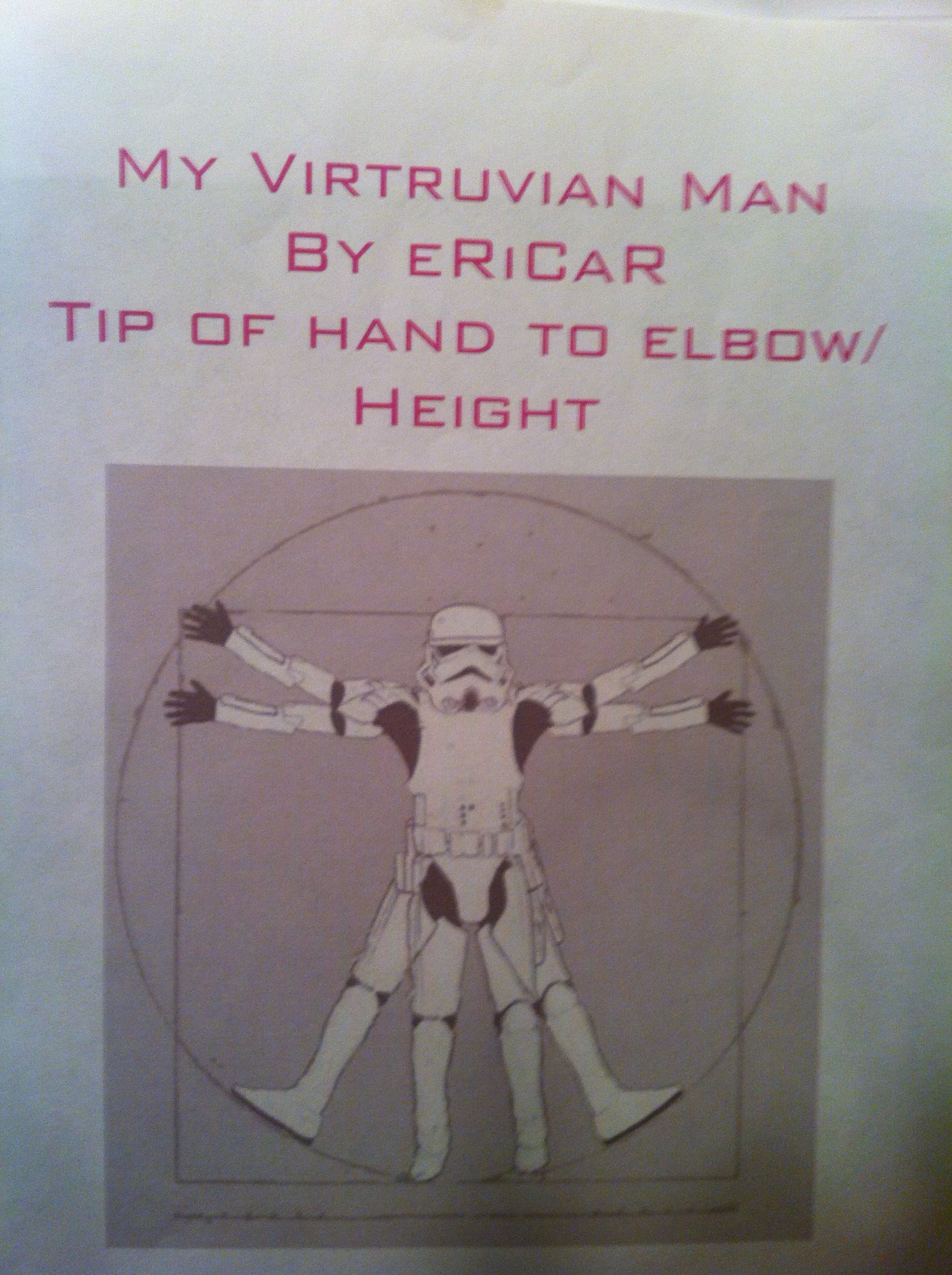
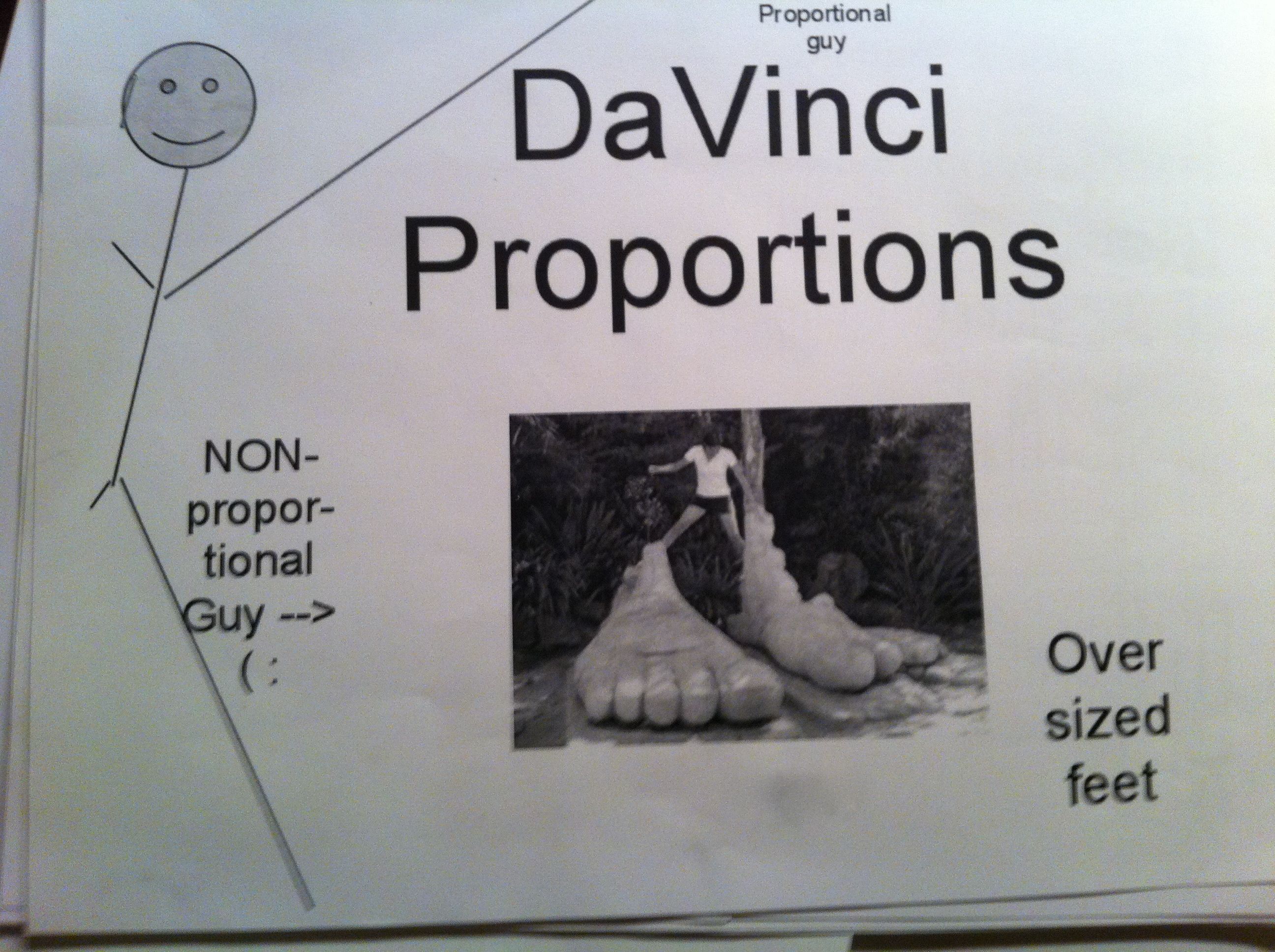
To make this a grade-able project I had them print out their data sheet and charts as well as make a cover sheet.  I showed them how to use Google word processing and Google drawing for the cover sheet (but that was optional).  On the day they were due, the students presented their projects to the class.  We discussed their findings as a class and talked about which measure of central tendency best represented their data.  They summarized that they weren’t very proportional (according to Da Vinci) because they weren’t finished growing yet!  But, they were most fascinated with interesting facts that they fond out about themselves (as in the fact that the person with the smallest hands did not have the smallest hands proportional to their height).  It was great fun!

The Black Death: Percents, Ratios, and Rates

As much as I love teaching math, sometimes wish I taught social studies.  History is so much fun!

In our 6th grade curriculum the students do a interdisciplinary project on the Middle Ages.  They study the Middle Ages in Social Studies, read period books and fairy tales in Language Arts, create Middle Age art, and even learn popular dances from the Middle Ages in dance class.  With all of the Middle Age fun coursing through the 6th grade, I could not be left out in math class!

The Land Of Matheval

I created “The Land of Matheval” for our Medieval Mathematics Unit.  Matheval was a fictional medieval community comprised of my 25 6th grade students.  I let all of my students pick a person from the Middle Age to become and research.  We were studying percents, ratios, and rates so I wanted to look at the percentages of the different classes of people of the Middle Ages.  To study rates, I decided to focus on the death rate of the Black Death across Europe.

Day 1:  Percent of the Population

When people think of the Middle Ages, they often think of Kings, Queens, and knights.  However, nobility was only about 1% of the population.  In our class we investigated the percentage of the Medieval population that was nobility (1%), monks and priests (5-10%), and commoners (90%).  We then took those percentages and applied them to our 25 6th graders to see how many of each class we would have. We had to do a little rounding and estimating so that we didn’t end up with half a person.  We ended up with 1 member of nobility, 1 monk and 1 priest, and 22 commoners.  The students were quite surprised that there was only one member of nobility among us!

Day 2:  Draw Your Role

I had the students draw their role from a hat to decide if they would be nobility, clergy, or common.  After drawing, we talked briefly about roles of commoners in the Middle Ages.  They had been discussing this in more depth in Social Studies so were already familiar with the roles.  The commoners got to pick a job.  For part of their homework, they were to enter their job and provide a brief description of their responsibilities on a Google Document that  I created.  I told them that since we were such a small community they could not duplicate jobs.

Day 3:  Estimate Your Chance of Survival

After they picked their roles I told them that we would be studying the Black Death.  I explained that many people in Europe died from the Black Death.  For part of their homework that night, they were to go onto their Google Docs and estimate their chance of survival according to the job that they had picked.  This was when the students realized it was NOT a good time to have picked being a rat catcher!

Day 4:  Rate of Death – The Black Death Arrives!

This day was one of those amazing teaching days that you wish you could have every, single day!  I arranged for the art teacher to dramatically interrupt our class to announce that the Pestilence had arrived!  What I didn’t know was that our art teacher was also the director of our school theatre productions OR that the social studies teacher would also join in the fun!  About five minutes into class, the art teacher exploded through our door screaming, “The Pestilence has arrived!” before dropping dead in our doorway.  She was then dragged out by their social studies teacher.  This was immensely entertaining and made QUITE an impression on my students!  With urgency, I told our students that our plans must stop at once today!  We needed to stop everything and learn more about THE BLACK DEATH!

We discussed the spread of the Black Death throughout Europe by analyzing graphs and charts I had on a Powerpoint.  We researched the population of Europe from 1347 to 1352 and discovered that 25 million people had died in 5 years.  We then calculated how many people died each year, each month, and each day!  As we continued on with our calculations, the numbers became more and more manageable (and thus realistic) for the students.  They wanted more, so we then calculated how many people died each hour and finally, how many people died each minute.

We discovered that an average of about 10 people died every minute during that time period in Middle Ages.  What did this mean for Matheval?  For our small class of 12 it meant that we could all be dead from the Black Death in about 60 seconds.  What could I do but set a giant timer on the overhead projector?  At this, the students actually began to panic.  My classroom became a flurry of voices, “The Black Death is here!”,  “I don’t want to die from the Black Death!”, and   “Let’s get out of here!”   Then, they asked me something unexpected.  They asked me, “Mrs. R, can we leave?”  At this point, what could I tell them but, “YES!  If you want to leave – GO!”  At that, they all RAN out of the door, and kept running!  They ran in all directions!  They ran completely across the entire soccer field.  And still, the time was counting down.  When the timer went off I screamed out the door, “TIMES UP!!  You are all DEAD!”  This is when they did something else I did not expect, they all “dropped dead” right where they were.  They were quite the spectacle!  I wish I would have anticipated this, as I would have loved to post those pictures to this post!  But, I was too caught up in the moment.  What else could I do now but loudly sing, “Bring in your dead!  Bring in your dead!”  (You should never miss a chance for a Monty Python moment!)

When the class was back, seated and winded, we discussed what had happened.  At hearing the Black Death was coming, what did all of my students do?  THEY RAN.  What happened to them anyway?  THEY ALL DIED.  But, what did they do in the meantime?  They spread the Black Death across the entire Woodlawn Campus!  We talked about how this was human nature, and many people in Europe probably reacted the same way that they did.  They fled, and they spread the Black Death.

I then opened the Google Doc and we looked at their estimated chance of survival.  After what we learned about the rate of death, we updated their percentages as a class.

It was a fantastic week, it was an amazingly fun lesson, and my students have not stopped begging for more activities like the Black Death!

Homework Hotline with Google Docs

I developed a “Homework Hotline” with a Google Docs spreadsheet to answer student questions in the evening.  The students can open it up at any time after school and type in their name, the time, which homework question they need help with, and any other questions they have.  I then get on from 9:00 – 9:15 pm to say “Hi!” and answer their questions.  Often, other students will get before 9pm and answer each other’s questions before I even get there (I love that)!

We use the spreadsheet but also the chat box for questions and help.   I have a separate page for each subject that I teach.  When it started, I would comment on the row below the question and hi-light it.  Now, I type into my own designated (purple-colored) column.  The new column is much easier for me and much easier for the students to follow.

I have found that this is a great way to answer student questions in the evening.  When I first started the “Hotline”,  students were on every night chatting with me.  It has calmed down quite a bit, but is still a very useful tool for evening questions.  Since it is much quieter now, I no longer go on every night at 9pm.  But, I usually check it once an evening to see if anyone has been on or has a question.  I now instruct the students to send me an email if they have questions and then I will get on the hotline that night to help them.

The two biggest drawbacks to the hotline are that writing equations and fractions in gdocs is awkward, and many kids are in bed by 9pm.  But, as I have kids myself, it is difficult for me to get on before mine are in bed too!  If I have an email request I will try to get on about 8:30pm.  Right now, I am averaging about 2 “Hotline Nights” a week.  I love being able to help out my students this way!

Here is a Sample Google Documents Homework Hotline (Blank).

Hotline

I am also playing with Scribblar and will try that with my students in the next couple of weeks.  Thanks so much to Twitter and @jrykse @druinok for “playing” Scribblar with me!  Great Tweeps are always there to help!  With my current workload I have missed out on Twitter lately and have really been missing out!

The Data of Germs and Hand Washing

Flu season is upon us – and we are working on percents!  What better time to estimate how many germs we have on our hands and investigate how long it really takes to get rid of them?  The CDC (Center for Disease Control and Prevention) defines proper hygiene as vigorous hand rubbing with soap for 20 seconds.  Most of my students were familiar with the 20 second rule, but not convinced of it’s effectiveness.  So, we decided to collect the data and find out for ourselves!

The Set-Up:
I gave them each a squirt of glowing germ simulating lotion which they rubbed onto their hands. We went into the bathroom, turned out the lights, and I shined the black light onto each students hands. This was FUN!  They were quite disgusted with the amount of “germs” on their hands. They were even more surprised to see so many “germs” on their faces, which they had obviously been touching way too much in the five short minutes since they had applied the lotion. It was easy to estimate at this point that the germ count on their hands was at 100%. Let the hand washing begin!

Hand Washing:
The students washed their hands with soap for 5 seconds and then rinsed. I turned the lights off again and we inspected them again with the black light. They were shocked (and disgusted) to see that their hands were still VERY dirty!  Each student then estimated the percent of germs still on their hands.

Rinse and Repeat:
Our goal was to analyze germ data at 5 second intervals for up to 20 seconds.  So we washed, analyzed, estimated, recorded and repeated three more times.

Results:
It took a solid 20 seconds to eliminate the majority of the “germs” from the students hands. The most difficult places to clean were the fingernails and the creases in the palms. The most often missed spot was right around the wrist.  Most of the girls were able to get the estimated percentage of germs down to about 2% while the boys seemed to get stuck at about 10%. The boys found this quite amusing.

Analysis:
After we finally got back to the classroom we loaded all our data into Google Docs and created line graphs.  We then uploaded them to the Handwashing page on our class Wiki.


After we graphed our data in Google Docs we discussed our findings. The kids were surprised that it took so long to wash all of the germs off of their hands even though most of them had either heard about the 20 second rule or knew of a “hand washing” song.  We then picked one of the songs, “Twinkle, Twinkle, Little Star” and sang it as a class while I timed us.  We all enjoyed singing and it took us 23 seconds to sing the song.

In Summary:
This was an extremely engaging and interesting activity!  It did take an entire class period as we only had four sinks and one black light.  But it really brought some fun to a cold winter’s day math lesson.

Looking Forward:
Next year I would like make this like a “Myth Busters” activity. I have since heard Myth Busters did a hand washing episode but could not find it. I would also like the students to do more data analysis and possibly even some comparative analysis.  For this, I am thinking of percent of change between the boys and girls or for each hand washing interval.