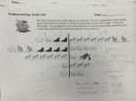
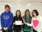
“I feel so accomplished!” is what I overheard a student say after doing the Noah’s Ark problem solving activity in my class today. I also heard, “You will REALLY like math class today! It was so hard, but so much fun!”
Give them all their own copy of the problem. (And a sheet of animals to cut out if they wanted it). Noah’s Arc PS
Let them read it silently
Let one of them read it aloud while other students read along silently.
Let them work silently for a few minutes.
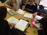
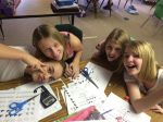
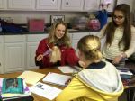
Let them work together.
Discuss solutions.
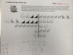
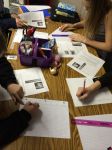
While working silently, many students came up with a solution. However, once they started working with others, they realized that their solutions may not be correct. I loved how they were explaining their solutions to their classmates, and their classmates would say, “Oh, but then you would have too many zebras.” and I would hear the, “Ohhhhh…” My favorite had to be “But WHAT is kangaroo? WHAT ARE YOU?” Several students asked for another copy because they had written all over theirs and wanted to start again.
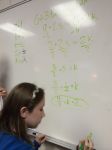
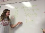
Giant Whiteboards are great for group work and presenting.
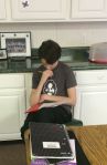
Working together.
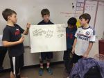
They loved the animals cut-outs.
Rebuilding the problem.
“I can’t stop until I figure this out!”
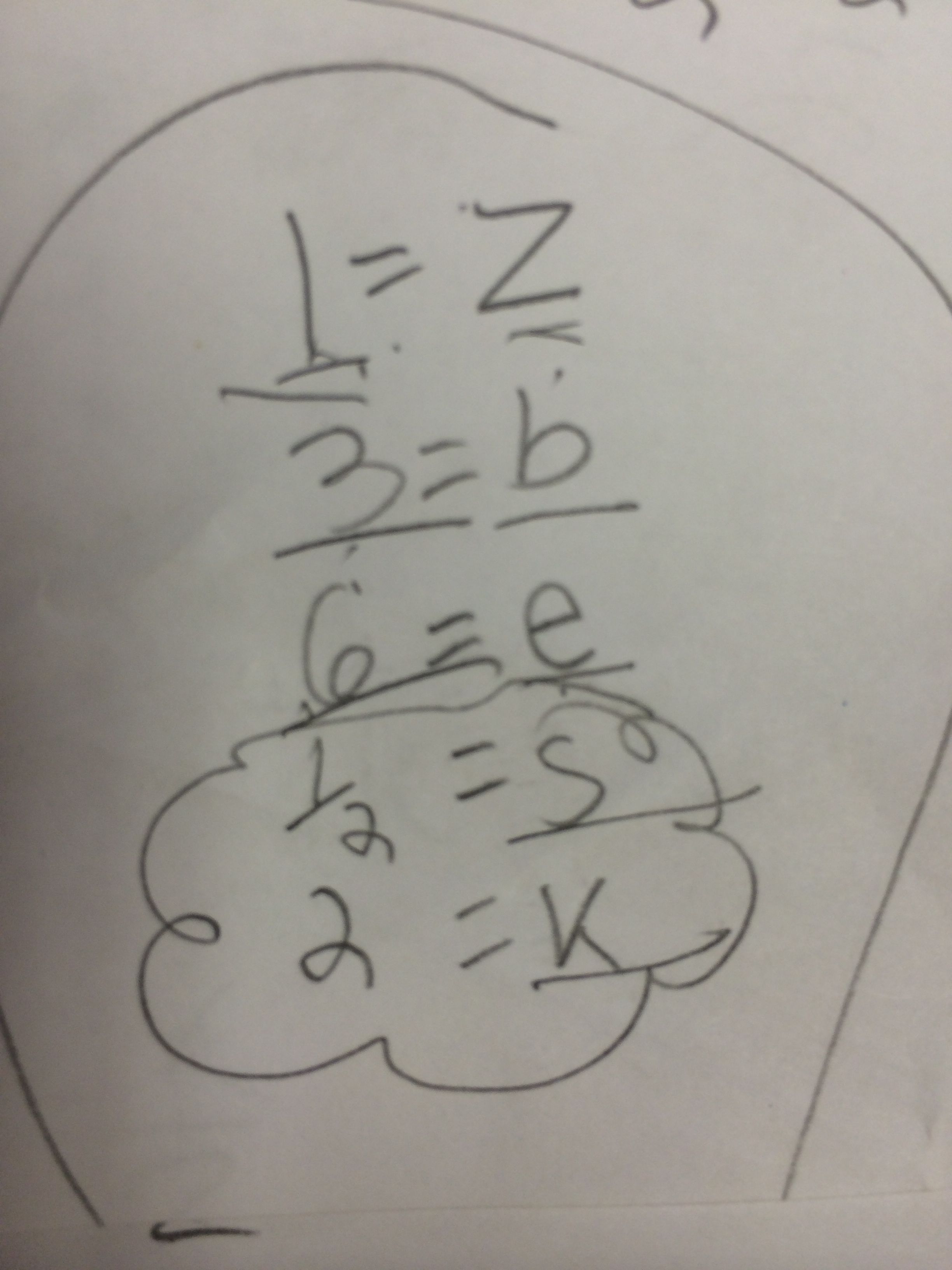
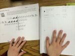
Some students let the animals equal animal values.
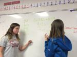
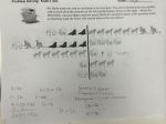
Most students had to work together to come up with the correct solution. A cluster of my students decided to assign point values to some of the animals, and variables for others.
This was an altered version of substitution, and so interesting for me to see. I loved how they molded the problem to fit their level of understanding. Their minds work in fascinating ways!
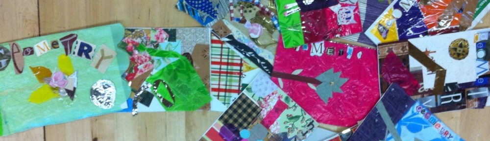
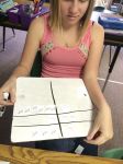
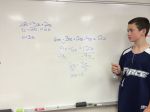
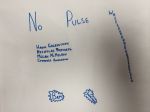
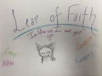
Student Solutions:
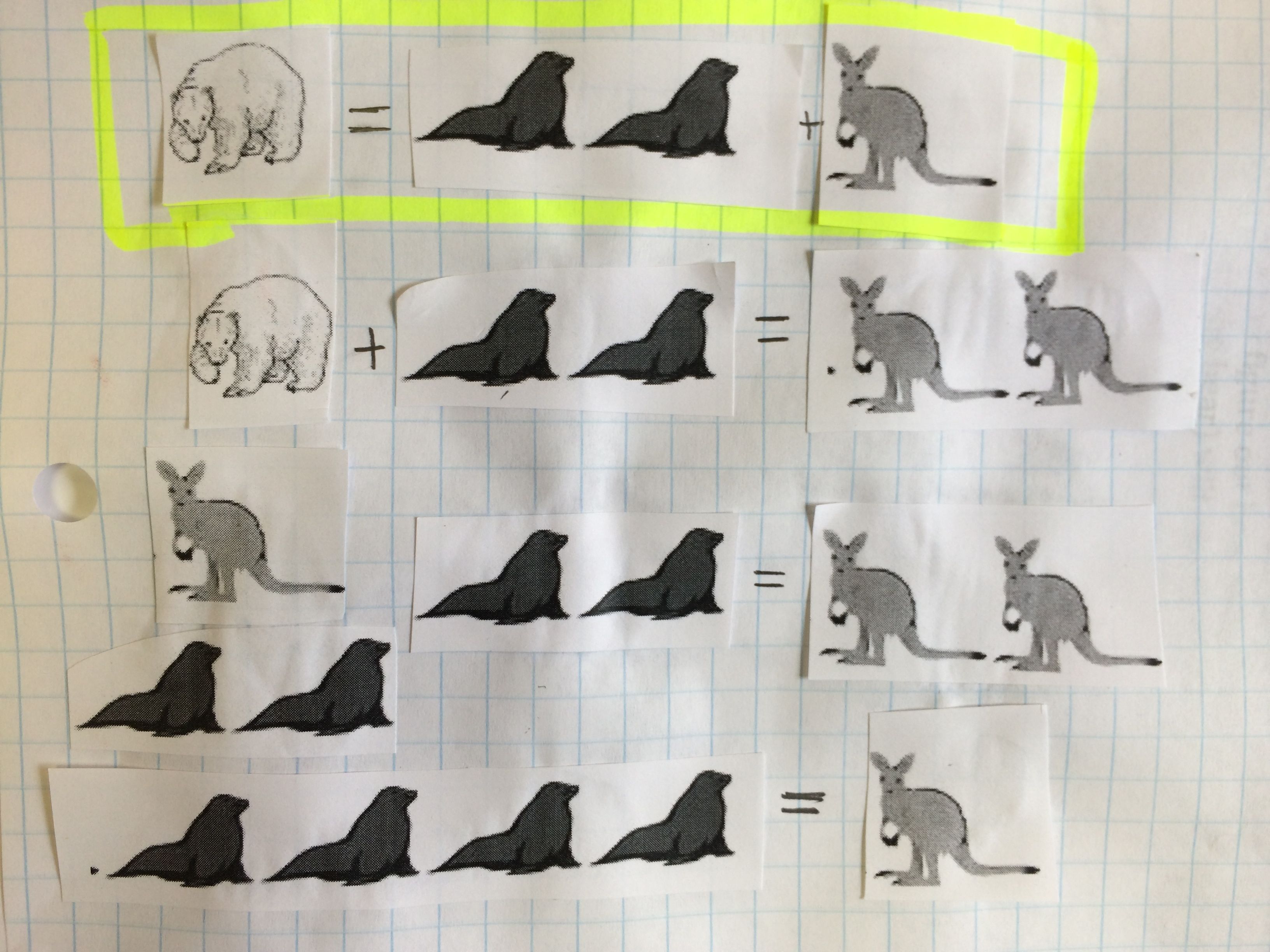
Here the animal cut-outs are used to visually show the substitution. This was helpful for the students who were not convinced by the algebraic solution.
I got this amazing idea from Bruno Reddy, @MrReddyMaths. Go and read his post here. I love his discussion about mean and deciding who should win! When I saw his post I knew it would be fun. I planned on using the data to calculate mean, median, and mode. However, I did not realize how much mileage I would get out of this one activity! I pretty much teach the entire data chapter using just the data from this one activity.
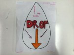
I have my students watch the “How to Make a Paper Airplane” video and give them the template. I do not give them any instructions and do not allow them to help each other. Following directions is always a skill I am trying to teach 6th graders.
After we make the airplanes, we get to fly them! Of course, I make it a competition. And of course, I video it!
Everyone gets a partner, to help with measuring, and three attempts at the best flight! Student’s whose planes fly backward get to record NEGATIVE flights. All three flights are recorded and then entered into a Google Form. For homework that night, they had to find the mean of their three flights.
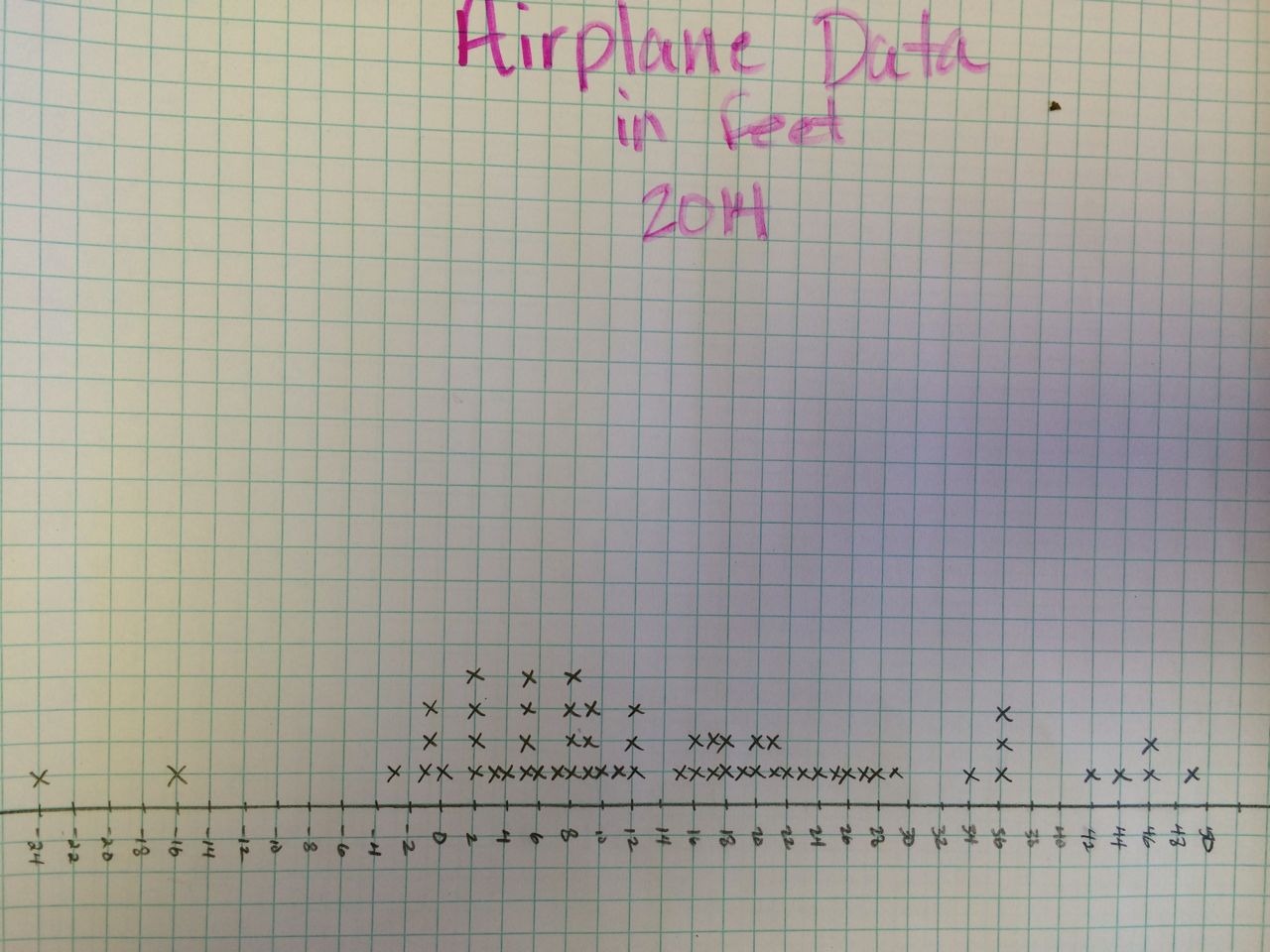
Line Plots and Scale:
I have students make a line plot out of all three entries. This year, I only had 21 students, so this is 63 entries. This is a great time to talk about scale. I have them record their distances in inches, but then they quickly realize that it is a much better idea to make the line plot using feet. We find the mean, median, and mode of our data using our line plot.
Range:
Range is one of my favorites here, especially with the inclusion of the negative flights. This year, our flights ranged from about -300″ to 600″. Predictably, almost all students told me that the range was 300″. Students love plugging values into formulas incorrectly. To help correct this misunderstanding, I had my -300″ flight student and my 600″ flight student come to the front of the room. I stood at the starting point (the edge of the blacktop for us, also known as 0) and had them stand where their respective planes had landed. Students immediately not only saw that 300″ was way off, but they saw why. This was a wonderful opportunity to show them that 600 – (-300) was indeed 900″, not 300″. My analogy to help deepen understanding was, “You leave from Charlotte to fly to New York, but you have a layover in Atlanta first”! Nothing is ever better than visual learning and real life examples.
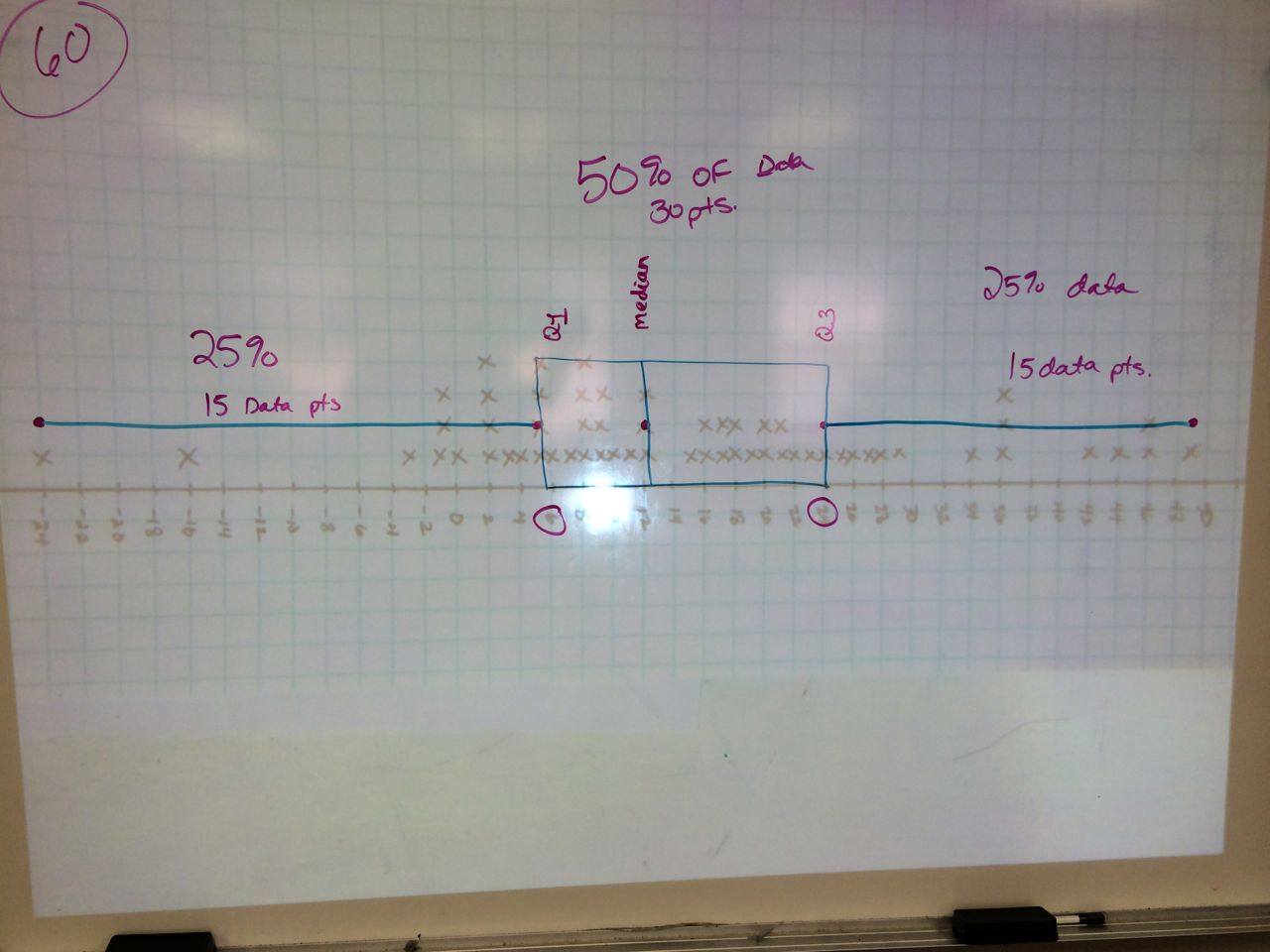
Box Plots:
The next day we learned about box plots. I project the line plot of our flight data and as a class we make it into a box plot. They loved seeing that a box plot can helpfully catagorize their data. Outliers are visual here, as well as where 50% of their flights landed. Next year I am going to take a picture of their airplanes laying on the blacktop to back this statistic up visually.
I also had the students create a box plot of their mean flight data. They wrote their mean flight length (in feet) on a sheet of 8×11.5 paper. Then, they organized themselves into a human box and whiskers plot. The students who were the lower and upper extremes, Q1, Q3, and median all held index cards with the name on them. We also decided who was in our interquartile range.
Histograms:
The line plot looks very much like a bar graph. After a very brief explanation about histograms, we turn our line graph into a histogram. The students love seeing their data grouped and of course ask why we didn’t do this in the FIRST place instead of making the tedious line plot. It’s all for the sake of learning. (Insert evil teacher smile.)
Google Doc Data:
I shared the data with the students and we then all made bar graphs and histograms on Google Spreadsheets. The students like the histograms better as it condensed the data into groups. They also learned how to sort the data and find the mean using a formula. Again, they love finding the mean using spreadsheet formulas, find it less “mean” than calculating it by hand, and call me a “mean” teacher for not showing them this in the first place! Practice makes perfect.
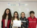
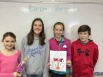
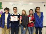
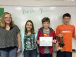
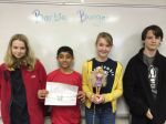
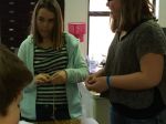
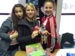
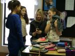
What a difference a year makes! My current students saw all of the Barbie Bungee action from the sidelines as 6th graders last year. They have been asking me ALL YEAR LONG when we were going to do Barbie Bungee. This build up was terrific! Once they knew Barbie Bungee had arrived, they were begging for math class.
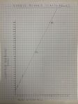
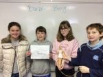
After all of the build up, my students took Barbie Bungee very seriously this year. I make it a competition, and they all wanted to WIN. They did multiple test drops, they measured carefully, and they drew beautiful graphs. I did not teach them about the line of best fit, but had them read about it here instead. I told them whoever had the most accurate data and the best line would win the competition! They were inspired to learn all about the line of best fit!
Again, I let them adjust their graph after the 90″ test jumps. This year I was tougher on them, and would not let them test jump again until they fixed their graphs.
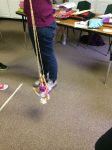
The big jump day was so exciting! Students were yelling and screaming. One group had a rubber band disagreement. They calculated the number of rubber bands and wanted to put a half of a rubber band on so their estimate would be perfect. They wanted to win. However, we don’t do half rubber bands, so the great rubber band debate ensued. They only agreed to put the last rubber band on seconds before the jump. It was a deadly mistake, and their Barbie was the only one to crash. It was a tragic (read great) learning lesson!
Please enjoy the pictures and the video. I have so much fun with this project and making the video each year. It is the best project I have ever done with my students!
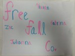
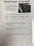
Group students and have them come up with a company name, slogan, goals, and logo for their Barbie Bungee company. Have them read about the line of best fit for homework.
Day 2
Give students the handout and let them do the test jumps and the graph.
Day 3
TEST DROP day from 90″. Students adjust their graphs if needed, and get to add a data point to their graph and adjust their line of best fit if needed.
Re-drop if needed once graph is completed.
Estimate how many rubber bands they will need to drop from 160″ and then attach those rubber bands to Barbie.
Day 4
JUMP DAY – Finish putting rubber bands on Barbie and then JUMP!
Don’t miss Global Math this Tuesday night, March 4th, Student Creativity in Math with Technology. Rafranz Davis (@rafranzdavis) will be presenting.
Rafranz is an instructional technology specialist for a Dallas/Fort Worth area school district. As an advocate for passion-based learning, Rafranz uses her experience as a secondary math educator to help teachers integrate technology using innovative teaching strategies aimed at empowering students to be autonomous learners.